


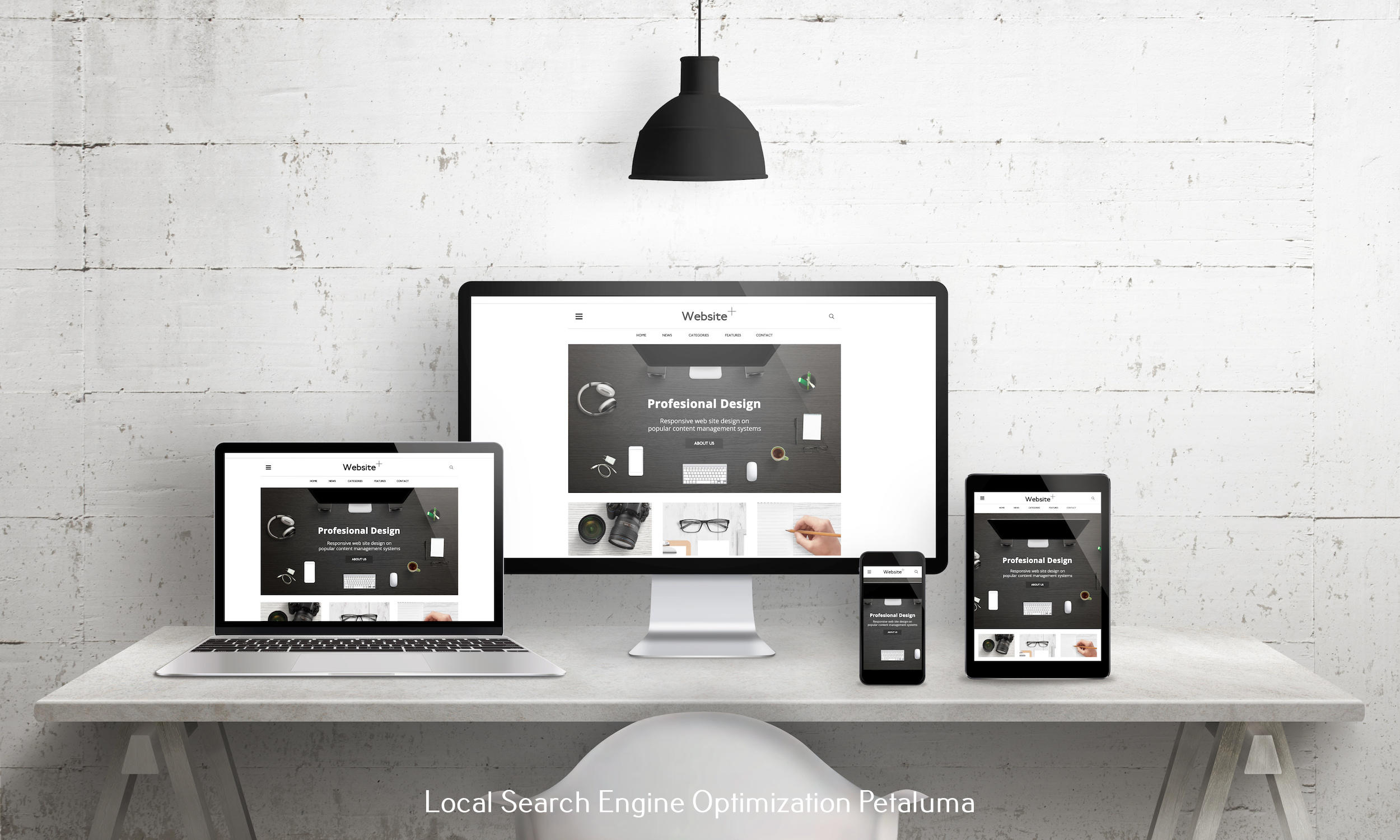


, for yourmighA website's call to action, or CTA, is a message or button that asks visitors to perform a particular action. This activity could range from completing a form to making a purchase. Any website must have CTAs because they help direct visitors toward the intended result and motivate them to take action.
A website needs a call to action for a variety of reasons. A CTA, first and foremost, aids in turning website visitors into clients. Businesses can increase the likelihood that website visitors will become paying customers by providing a clear and compelling message that encourages the user to take a particular action.
A CTA also contributes to a website's overall effectiveness increase. Businesses can increase website conversions and user satisfaction by guiding visitors to take a particular action. Higher engagement and greater customer loyalty may result from this.
A CTA can also assist companies in monitoring the success of their marketing initiatives. Businesses can determine which messages and calls to action are most successful at generating conversions by analyzing the performance of various CTAs, and they can then modify their marketing strategies as necessary.
So how do you design a call to action that works for your business? Here are some ideas:
- Make it distinct and clear: What action the user should take should be made crystal clear in the CTA. Be as specific as you can, while avoiding language that uses jargon, or is ambiguous. “Sign up for our newsletter,” for instance, is more persuasive than “Learn more.”
- Use language that encourages action. To encourage the user to take action, use action oriented words like “Sign up,” “Buy now,” or “Learn more.”
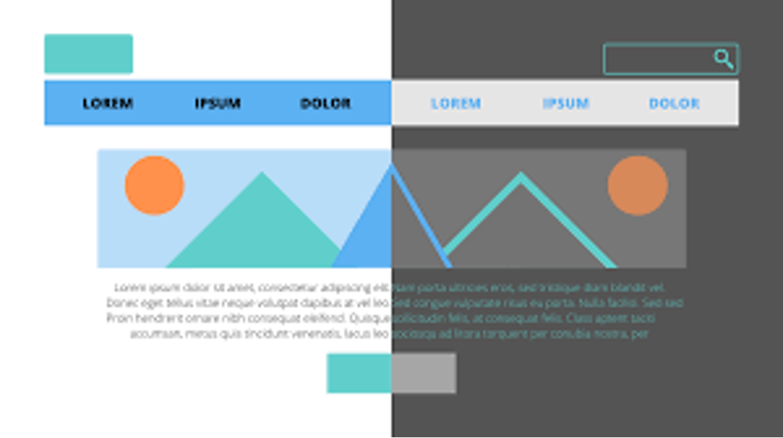
- Use compelling visuals: To get the user's attention on the CTA, use eye-catching buttons or graphics.
- Use contrasting colors. Make the CTA stand out from the rest of your website by using a color that contrasts with the rest of the site and the background color. This will make it easier for the user to notice it.
- Put the CTA in a visible spot: The CTA needs to be placed on the website in a spot that is simple for visitors to find and click on. This might appear as a pop-up, above the fold, or in the navigation bar.
- Test, Test, TEST! To determine which CTAs are most successful at generating conversions and click throughs – it is important to test variations of your call to action text, the links you take them to – even the color of your buttons. A/B testing or an examination of website metrics like clicks and conversions can be used to achieve this.
A call to action is a crucial component of every website, as it encourages users to move from being a viewer, to someone who engages with your content. It increases a website's overall effectiveness, aids in turning website visitors into customers, and enables companies to monitor the success of their marketing initiatives. RAD Web Marketing can assist you in identifying and putting into practice crystal-clear call to actions that increase conversions if you are a small business owner looking to enhance the effectiveness of your website.

0 Comments