


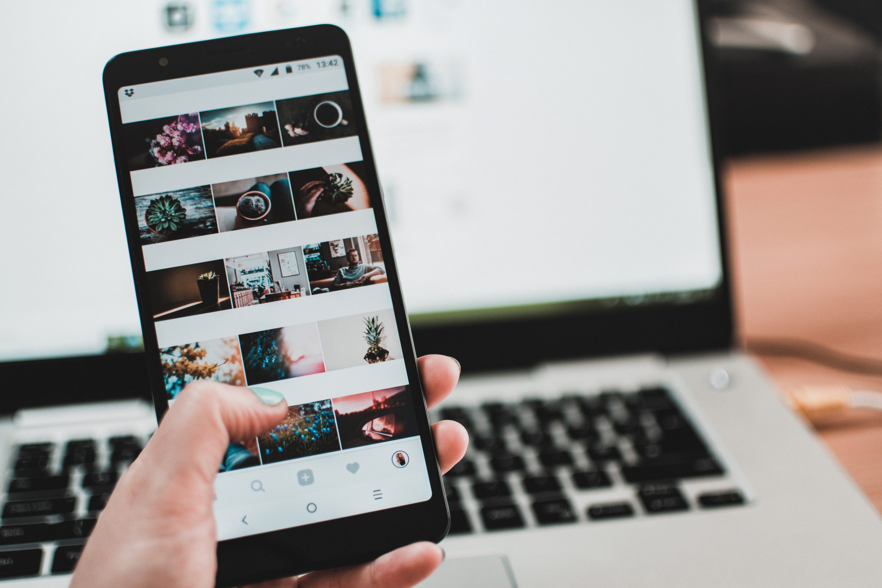


As human beings, we are inherently visual creatures. Our minds are wired to perceive and interpret the world around us through colors. It's no surprise then that color plays a crucial role in web design, and understanding its psychology can greatly impact how users perceive and interact with a website.
In today's digital age, businesses rely heavily on their online presence to attract and retain customers. And as the competition grows, it's becoming increasingly important for websites to stand out and make a lasting impression on users. This is where the psychology of color comes into play.
In this article, we'll dive into the world of color psychology in web design and explore how different colors can affect user perception.
The Basics of Color Psychology
Before we dive into the specifics of how colors affect user perception, let's first understand the basics of color psychology. Color psychology is the study of how colors influence human behavior, emotions, and decisions.
Different colors evoke different emotions and can even influence our purchasing decisions. For example, red is often associated with passion, excitement, and urgency – making it a popular choice for brands in industries such as food or retail. On the other hand, blue is often associated with trustworthiness and professionalism – making it a suitable option for businesses in finance or technology.
Now that we have a basic understanding let's take a closer look at some common colors used in web design and their effects on user perception.
Red: The Color of Urgency
As mentioned earlier, red is commonly associated with urgency – which makes it an excellent choice for call-to-action buttons such as “Buy Now” or “Sign Up.” It's also known to stimulate appetite – which explains why many fast-food chains use red in their branding.
However, overusing red can have negative effects such as creating feelings of anxiety or aggression. So when using red in your web design, be sure to balance it out with neutral tones to create an overall calming effect.
Blue: The Color of Trust
As one of the most popular colors, blue is often associated with trust, security, and professionalism. It's a versatile color that can be used in a variety of industries from healthcare to finance.
In web design, blue is often used as the primary color for corporate websites or online platforms that require users to input personal information. Its calming effect also makes it a great choice for websites that aim to promote relaxation or wellness services.
Yellow: The Color of Optimism
Yellow is known for its ability to evoke feelings of happiness and optimism. It's often used in web design to grab attention and create a sense of excitement. However, overusing yellow can be overwhelming and even cause eye strain – so use it sparingly.
Green: The Color of Balance
Green is closely associated with nature and balance – making it an excellent choice for brands that promote health, growth, and sustainability. It's also known to have a calming effect and can be used in web design to create a sense of harmony.
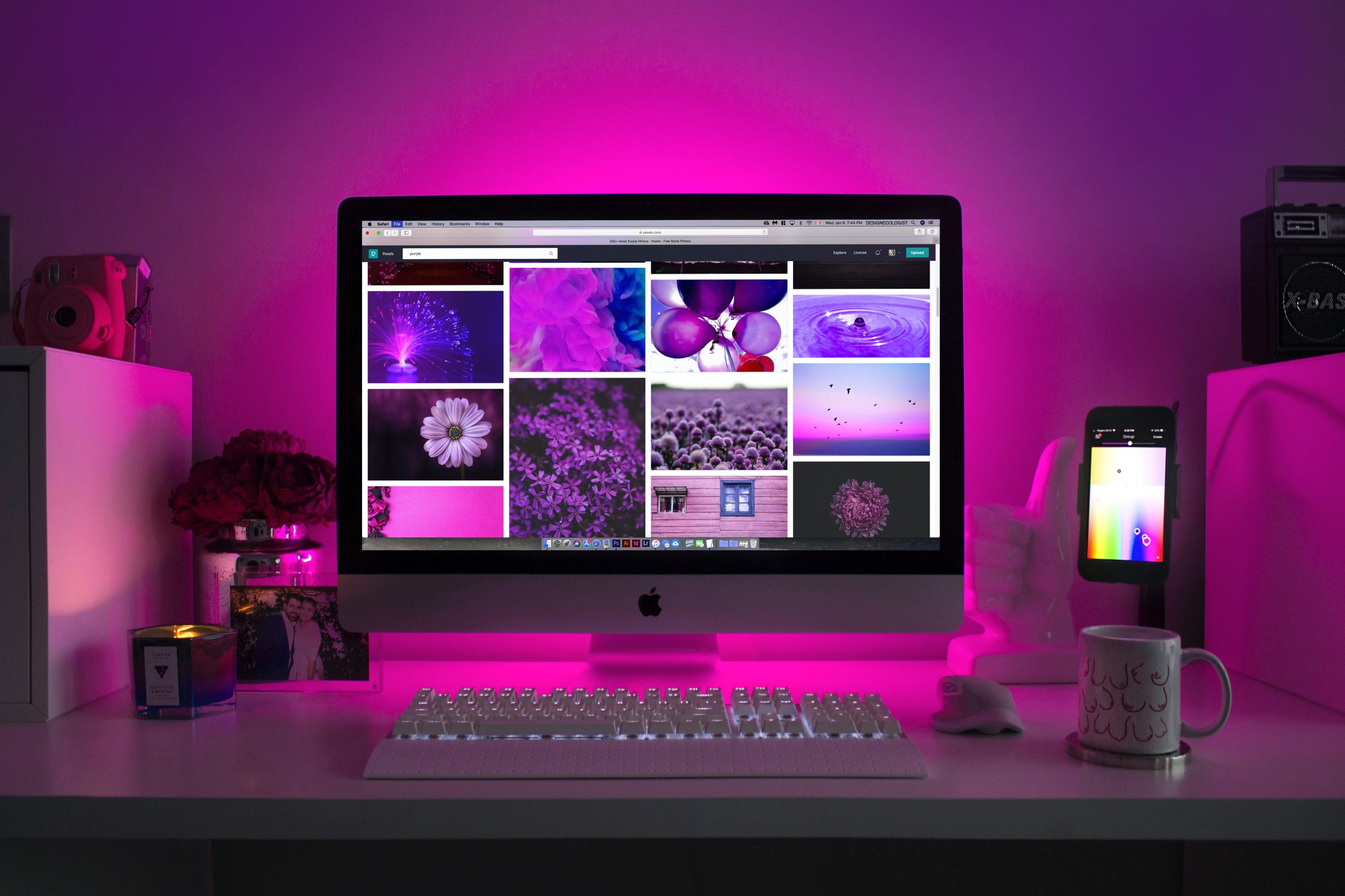
Purple: The Color of Luxury
Purple has long been associated with royalty and luxury – making it an ideal choice for high-end brands or products. It's also commonly used in the beauty industry as it evokes feelings of creativity, romance, and sophistication.
Black: The Color of Sophistication
Black exudes power, elegance, and authority – making it a popular choice for luxury brands or products aimed at high-end consumers. However, too much black can create a sense of heaviness or seriousness – so use it strategically in your web design.
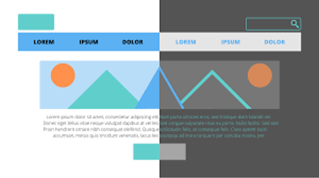
The Power of Contrast
Now that we've discussed some common colors used in web design let's talk about the importance of contrast. Contrast refers to the difference between light and dark elements on a webpage.
Using contrasting colors can help draw attention to specific elements such as call-to-action buttons or important information. This not only helps improve the visual hierarchy of a webpage but can also guide users towards desired actions.
For example, using a bright yellow call-to-action button against a dark background can help make it stand out and attract users' attention.
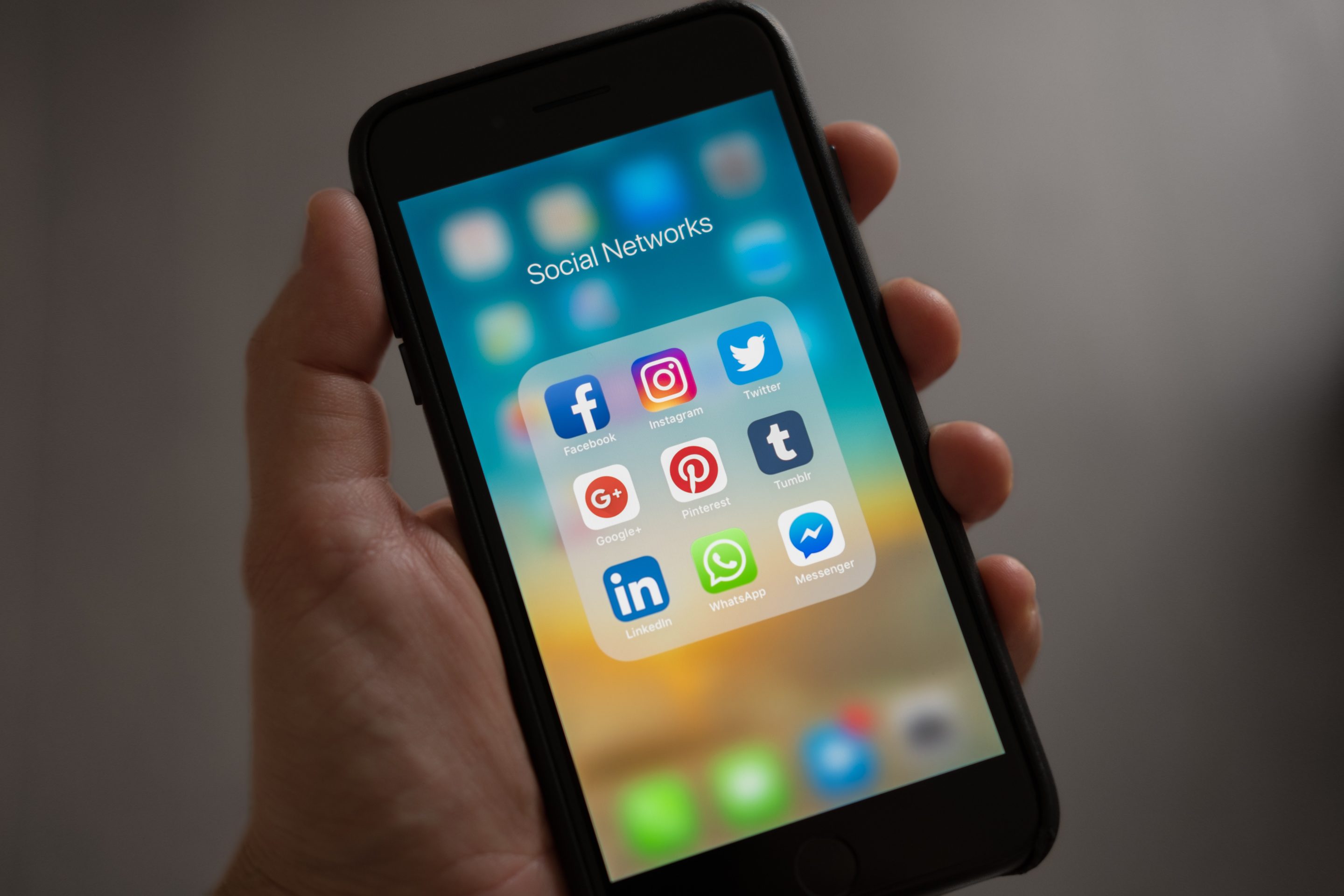
The Role of Color in Branding
Aside from influencing user perception, color also plays an essential role in branding. Consistency is key when it comes to branding, and using consistent colors across all marketing channels helps create brand recognition and build trust with the audience.
Think of some of the most recognizable brands such as Coca-Cola or McDonald's – their logos feature consistent colors that have become synonymous with their brand identity.
In Conclusion
As we've seen, color psychology is an essential element in web design that can greatly impact user perception and behavior. By understanding how different colors evoke emotions and influence decision-making, businesses can create a visually appealing website that effectively communicates their brand message. Remember to use colors strategically and consistently to create a strong brand identity that resonates with your target audience.


0 Comments