When it comes to ensuring that customers have a positive experience on your website, the navigation structure is key. Seamless navigation means that the user can quickly and easily get from point A to point B without having to hunt for what they’re looking for.
Understanding User Experience
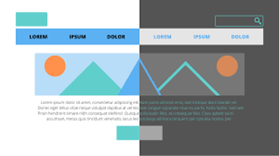
User experience (UX) is a term used to refer to how a website looks, feels, and functions. It's all about creating an enjoyable journey for the visitor from start to finish. A great UX design helps customers find what they need fast so that they don’t become frustrated and abandon the website altogether – something no business wants!
The importance of UX design in web development cannot be overstated. In fact, it’s often considered one of the most important elements of web development. That being said, crafting a seamless navigation structure requires more than just a good UX designer – it requires careful consideration from all those involved in the web development process.
Designing an Appropriate Structure
When designing a website navigation structure, it’s important to think about how users will interact with your site. How will they find their way around? What information should be easy to access? What kind of menus should you use? These are important questions that need to be answered before you even begin designing your site's navigation structure.
A great place to start is by mapping out the information architecture (IA). IA refers to how information is organized on a website – essentially, it’s like an outline of how your site should be organized in order for visitors to quickly find what they need without getting lost or overwhelmed by too much content.
An IA map consists of sections and subsections that contain page titles and labels as well as other important pieces of information such as keywords and page descriptions which help users understand where they are on your site at any given time. Maps like this are also incredibly useful when designing dropdown menus or sidebar menus as these can be based directly off the IA map itself.
Testing Your Navigation Structure
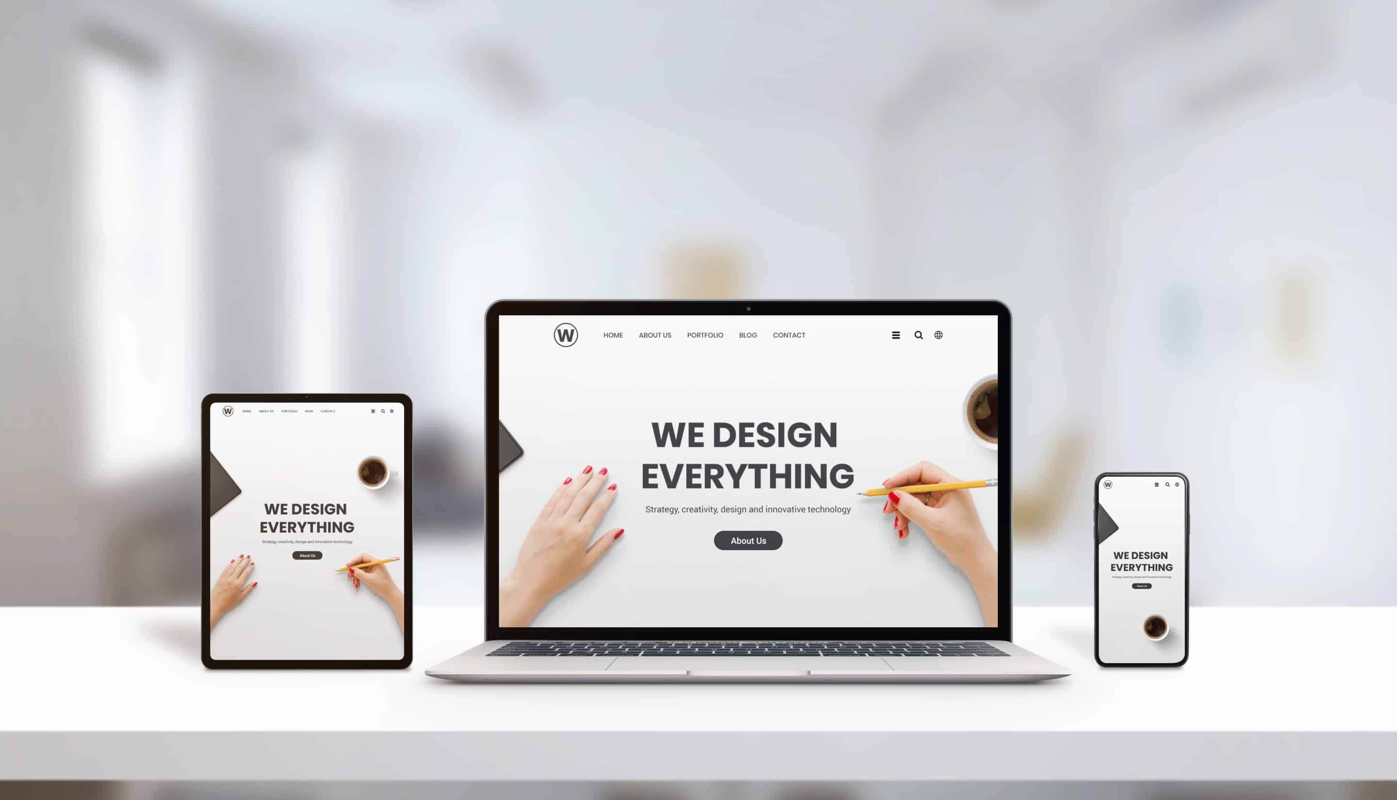
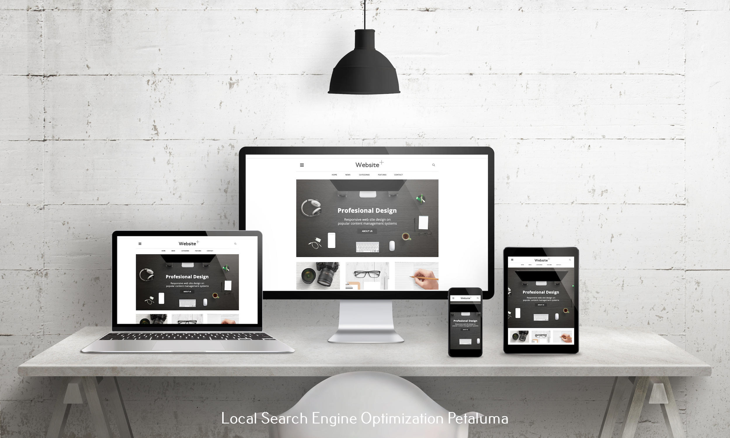
Once you have completed your IA map and put together your navigation menu(s), it’s time for testing! Testing is essential when it comes to making sure that everything works correctly on both desktop and mobile devices – after all, if something doesn't work properly then chances are visitors won't stay very long!
When testing out your navigation structure there are several things you should look out for:
1) Is each page accessible with just one click? If not then consider revising some links or adding additional ones so users can easily go from one page to another without too much effort;
2) Does each page load quickly? Pages should load almost instantly upon clicking; if not then you may want consider optimizing them further;
3) Are there any dead-end pages or pages with no exit options? If so then make sure these pages provide links back or forward so visitors can go somewhere else;
4) Do all images appear correctly across all devices? This includes making sure images don't overlap text or run off-screen;
5) Is everything laid out logically? Think about headings/subheadings/labels etc.; these should make sense logically as well as aesthetically;
6) Are links clearly visible while still blending into their surroundings nicely (i.e., don't stand out too much)? Links should not be distracting but also easy enough for users to spot them quickly;
7) Are all menu items clearly labeled according to their respective categories/sections/functions etc.? This will help users figure out where exactly each item belongs right away without having guess where things might fit best themselves;
8) Can visitors easily search through content using search boxes or filters? Search boxes allow users find specific items within larger collections while filters allow them narrow down their search results even further based on certain criteria such as price range or color etc.; finally…
9) Is there an option for returning visitors who might want save certain preferences (e.g., language settings)? This could potentially save time in future visits if someone doesn't have remember set everything up again every single time!
By taking all these points into account when testing out your navigation structure you'll definitely improve customer satisfaction rates overall since people won't have struggle trying figure things out!
Conclusion: Crafting a seamless website navigation structure isn't always easy but with careful consideration plus lots of testing you'll certainly make sure customers have an enjoyable experience navigating through your site!










0 Comments