


As a seasoned copywriter, I've seen firsthand the impact that persuasive and informative copy can have on sales. But, what if I told you that there's another powerful tool you can use to boost your conversions even further? That tool is color psychology in user experience design.
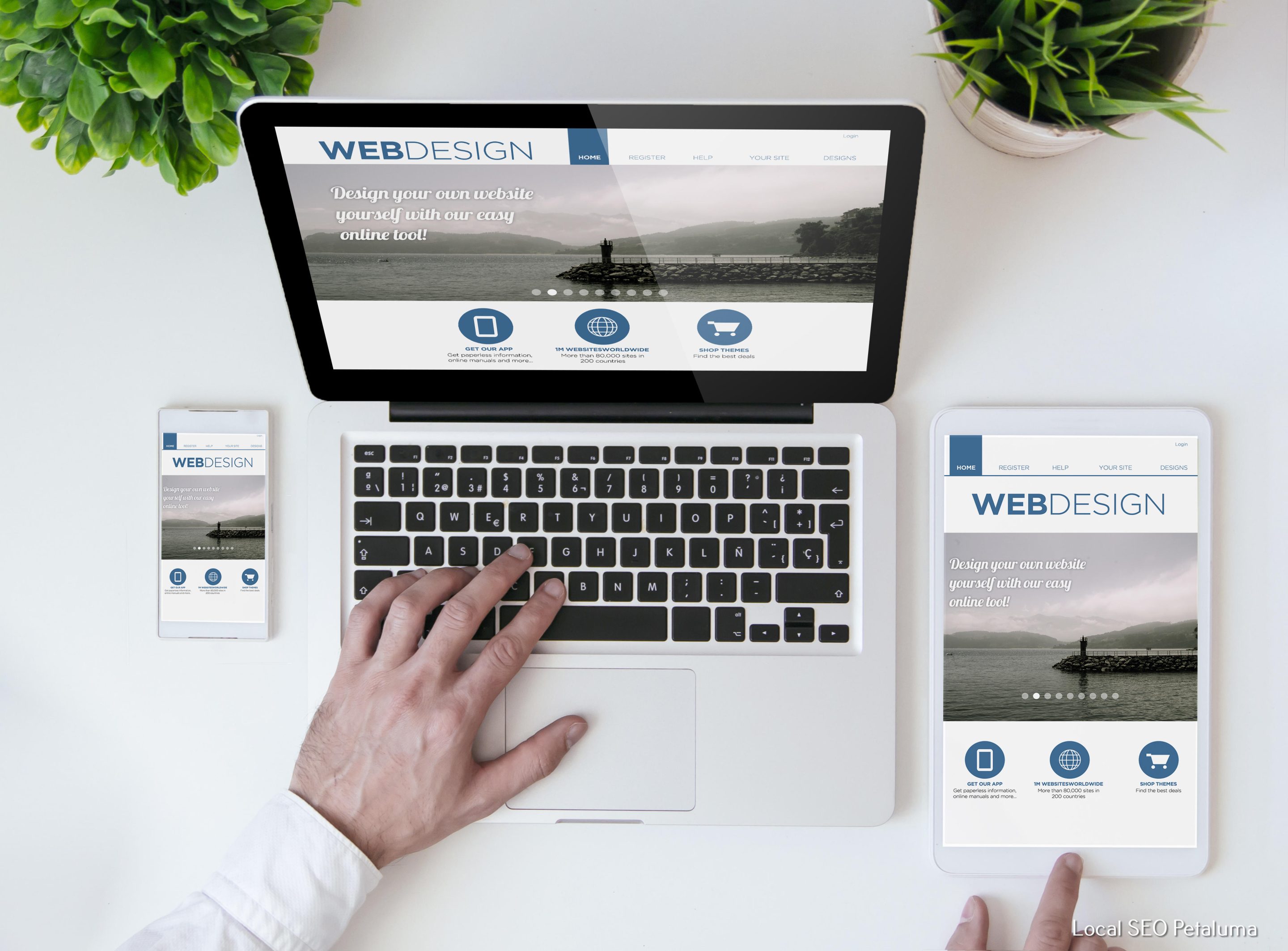
In today's digital world, user experience (UX) has become a key factor in the success of any website or app. And one crucial aspect of UX that is often overlooked is the use of color. But make no mistake, color has a significant influence on how users perceive and interact with your website or app.
So let's dive into the power of color psychology in UX design and how you can use it to enhance your user's experience.
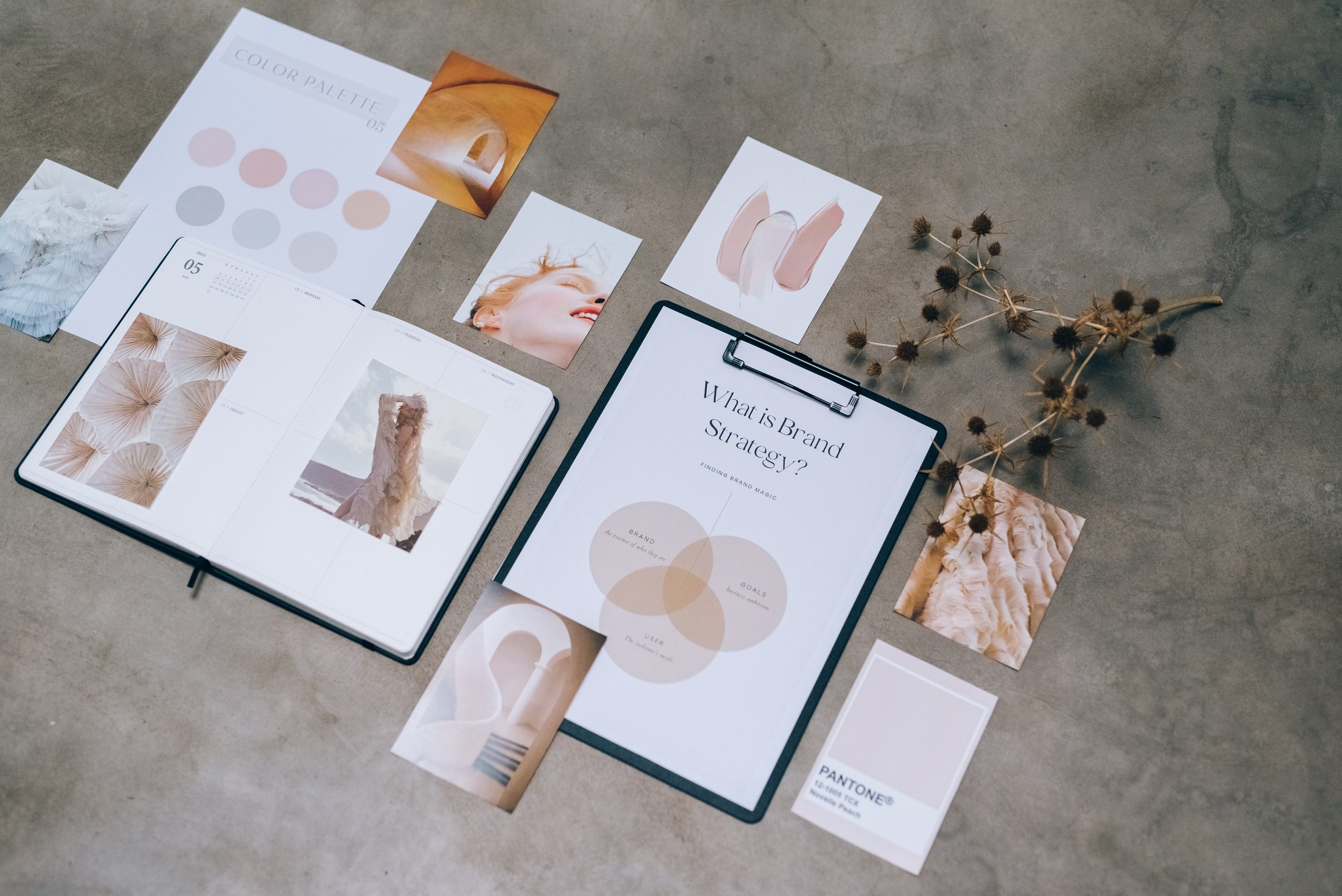
The Basics of Color Psychology
Color psychology is the study of how colors affect human behavior and emotions. It may sound like a new concept, but it has been around for centuries. Ancient civilizations used colors to communicate messages and evoke specific emotions in their art and architecture.
Fast forward to today, and we see this concept being applied in marketing, branding, and most importantly, UX design. Each color has its own unique meaning and can trigger different emotional responses from people.
For example, red is associated with passion, excitement, and urgency. On the other hand, blue represents trustworthiness, calmness, and stability. These associations are deeply ingrained in our minds due to cultural influences and personal experiences.
Understanding these associations is crucial when it comes to incorporating colors into your UX design strategy.
The Role of Color in User Experience Design
As mentioned earlier, color plays a significant role in how users perceive and interact with your website or app. Here are some ways in which color impacts UX design:
1) Branding: One of the primary functions of colors is to represent brand identity. The colors you choose for your brand should align with its values and personality. For example, vibrant colors like orange and yellow are often associated with energy and creativity, making them a suitable choice for brands in the tech industry.
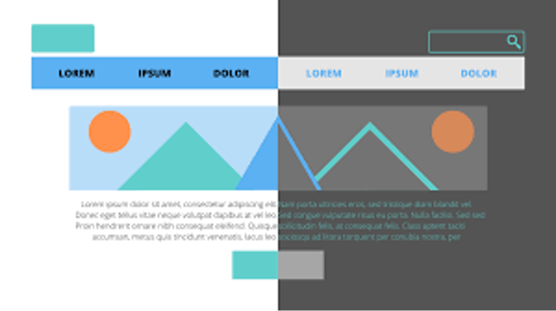
2) Visual Hierarchy: The colors you use can also help create a visual hierarchy on your website or app. This is crucial as it guides users to the most important elements on your page. For instance, using bold and contrasting colors for your call-to-action buttons can draw users' attention and encourage them to take action.
3) Emotions: As mentioned earlier, each color has its own emotional associations. By strategically using colors that align with the emotions you want to evoke in your users, you can create a positive user experience. For example, if you want to create a sense of calmness on your website, using shades of blue or green would be ideal.
4) Accessibility: Inclusive design is now more critical than ever in UX design. Choosing color combinations that are accessible to users with color blindness or other visual impairments is essential. This not only ensures equal access but also contributes to a better user experience for all.
Examples of Color Psychology in UX Design
Now that we understand the impact of color psychology in UX design let's look at some real-life examples:
1) Facebook: The iconic blue used by Facebook is no coincidence; it was chosen intentionally. Blue represents trustworthiness and security, which aligns with Facebook's goal of connecting people and building relationships.
2) Spotify: The music streaming giant uses vibrant shades of green throughout its app. Green is associated with growth and freshness, which perfectly represents Spotify's brand as an innovative music platform.
3) Netflix: Netflix's signature red color creates a sense of urgency and excitement when scrolling through their vast library of content. It also stands out against their black background, making it easy for users to find what they're looking for quickly.
In Conclusion
Color psychology may seem like a small aspect when it comes to UX design, but its impact is significant. By understanding the associations and emotions behind each color, you can create a more engaging and effective user experience for your audience.
So the next time you're designing a website or app, don't underestimate the power of color. Use it strategically to represent your brand, guide users, and evoke the right emotions. Your users will thank you for it with increased engagement and conversions.

0 Comments