


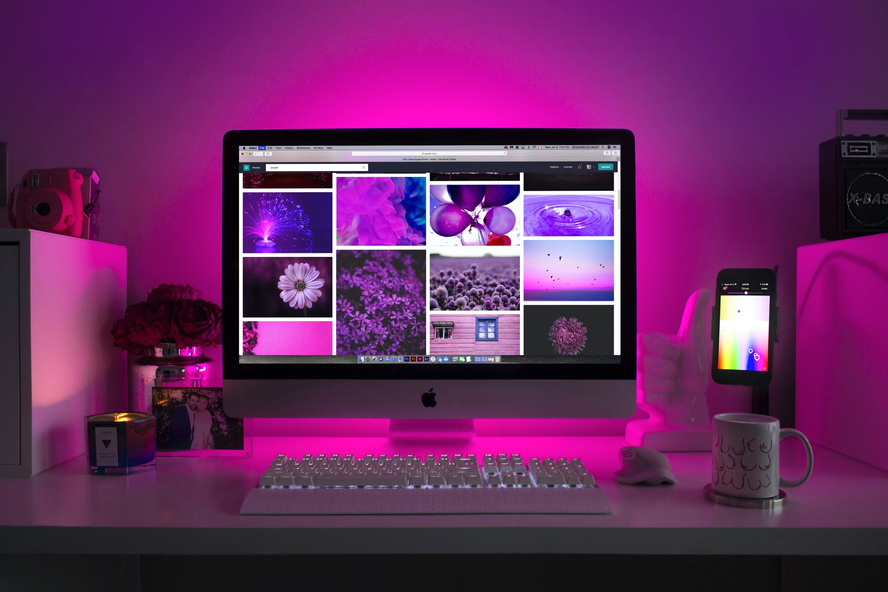
Have you ever clicked on a website and immediately felt drawn in by its colors? Or perhaps you've been turned off by a site that seemed to clash or lack any cohesive color scheme. Believe it or not, the colors used on a website can have a significant impact on the user's experience and their likelihood of converting into a customer.
At RAD Web Marketing, we understand the power of color psychology in landing page design. As digital marketers serving North Bay and Sebastopol, CA, we have seen firsthand how strategically using color can make all the difference in driving conversions. In this article, we'll explore the different ways to incorporate color psychology into your landing pages to achieve maximum results.
Creating an Emotional Connection
Color has the ability to evoke emotions and trigger specific responses from individuals. For example, the color red is often associated with passion, excitement, and urgency. When used on a call-to-action button or in limited amounts throughout a landing page, it can help create a sense of urgency and motivate users to take action.
On the other hand, blue is often associated with trustworthiness, stability, and calmness. This makes it an ideal choice for businesses looking to establish trust with their audience. Using blue as a primary color on your landing page can help instill confidence in potential customers.
Understanding your target audience's emotional triggers is crucial when selecting colors for your landing page design. By tapping into these emotions through strategic use of colors, you can create a stronger connection with your audience and increase their likelihood of converting.
Establishing Brand Identity
Colors are also an essential aspect of brand identity. Consistency in branding helps build brand recognition and trust among consumers. Incorporating your brand's colors into your landing pages not only helps establish consistency but also reinforces brand recognition with each visit.
For example, McDonald's iconic golden arches are instantly recognizable because they consistently use bright yellow across all their marketing materials. By incorporating your brand's colors into your landing page design, you can create a cohesive and memorable experience for your audience.
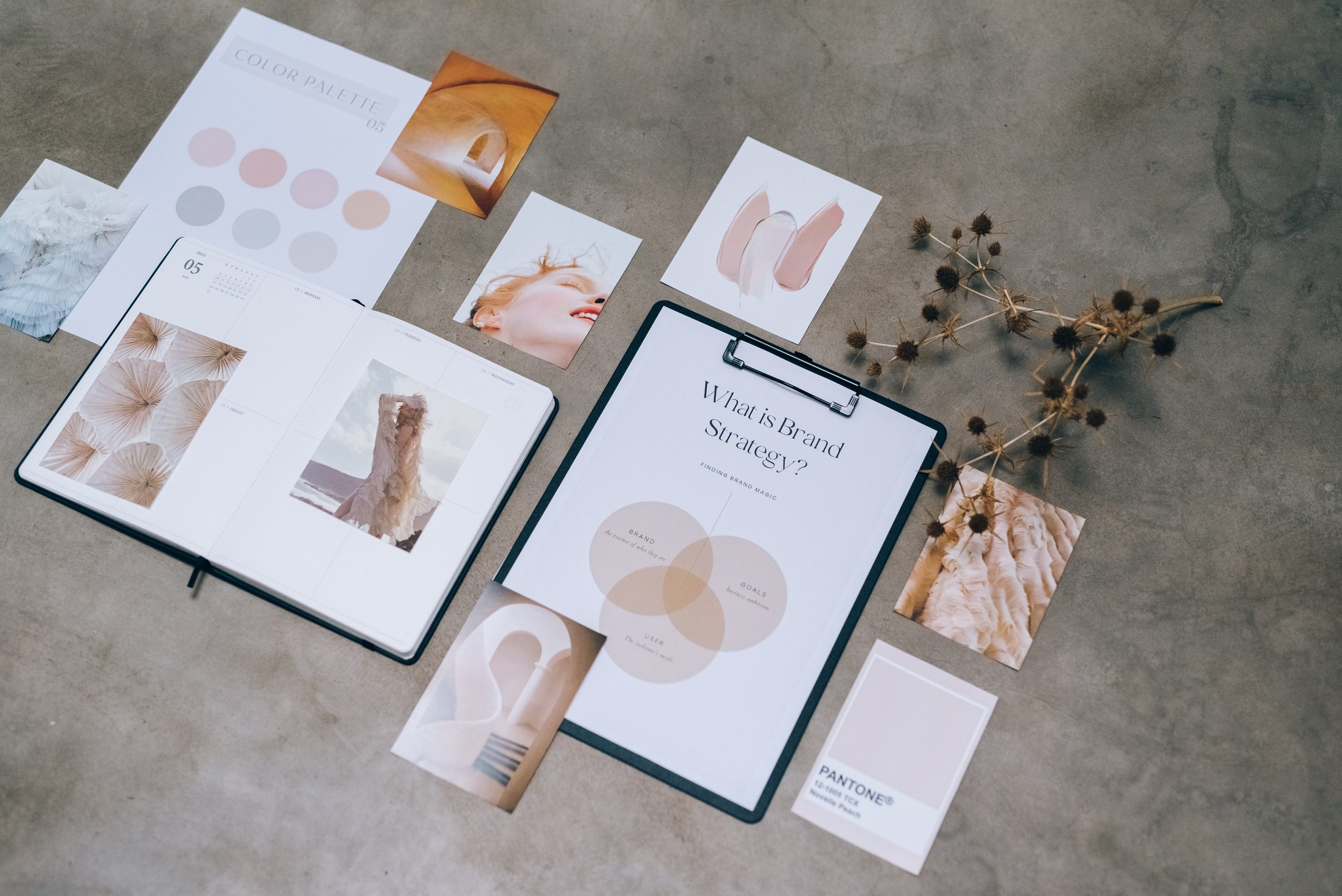
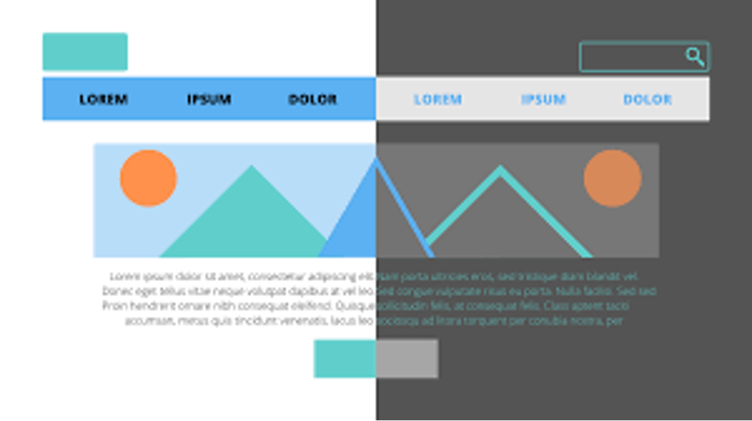
Choosing the Right Color Palette
When it comes to choosing the right color palette for your landing page, it's essential to consider both the emotional response and brand recognition. Using too many colors can be overwhelming and distract from the main message, while using too few can make a page seem dull and uninteresting.
A good rule of thumb is to stick to a maximum of three primary colors in your design. These should include one dominant color, one accent color, and one neutral color. The dominant color should align with your brand's identity and evoke the desired emotion, while the accent color can be used sparingly to draw attention to important elements such as call-to-action buttons. The neutral color will help balance out the design and prevent it from feeling too overwhelming.
Incorporating Color Contrast
Color contrast is crucial in making sure that important elements on your landing page stand out. This includes headlines, calls-to-action, and any other key information you want visitors to notice immediately.
The most effective way to create contrast is by pairing light colors with dark ones. For example, using a dark blue headline against a light blue background will make it stand out more than if both were shades of blue. Another way to create contrast is by using complementary colors (colors opposite each other on the color wheel), which naturally draw attention when placed next to each other.
However, be cautious not to use too much contrast as it can also have a negative impact on readability and user experience. Finding the right balance between contrast and harmony is key.
Testing for Optimal Results
As with any marketing strategy or design element, testing is crucial in determining what works best for your specific audience. A/B testing different variations of landing pages with different color schemes can help you determine which one drives more conversions.
For example, you may find that adding more red to your call-to-action button results in a higher click-through rate. Or, you may discover that using a different accent color on your landing page leads to more time spent on the page. By continuously testing and tweaking your landing page design, you can optimize it for the best possible results.
In Conclusion
In today's highly competitive digital landscape, it's essential to make every aspect of your landing pages count. By understanding the power of color psychology and strategically incorporating it into your design, you can create a stronger emotional connection with your audience, establish brand recognition, and ultimately drive more conversions.
At RAD Web Marketing, we specialize in creating visually appealing and high-converting landing pages for businesses in North Bay and Sebastopol, CA. Contact us today to see how we can help take your landing page design to the next level with our expert knowledge of color psychology.

0 Comments