


Web design is a crucial element in creating an accessible and inclusive online experience for all users. As developers, it's our responsibility to ensure that we are not only delivering visually appealing websites but also ones that are user-friendly and accessible to everyone, regardless of their abilities. One significant aspect of web design that often gets overlooked is color contrast. In this guide, we'll explore the importance of color contrast in web design for accessibility and how it can greatly impact the user experience.
What is Color Contrast?
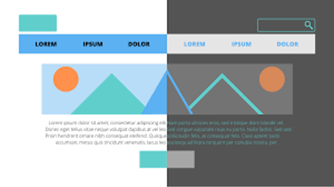
Color contrast refers to the difference in luminance or brightness between two colors on a webpage. It is an essential aspect of web design as it affects how easily users can read and perceive content on a website. Good color contrast ensures that text and other important elements stand out from the background, making them easier to read and understand.
Why Is It Important for Accessibility?
According to the World Health Organization, around 15% of the world's population lives with some form of disability. These disabilities include visual impairments such as color blindness or low vision, which affect an individual's ability to perceive colors accurately. For people with these disabilities, good color contrast is crucial in enabling them to navigate and understand information on a website.
Additionally, good color contrast also benefits those with situational disabilities, such as temporary injuries or aging eyesight. By making our websites accessible through proper use of color contrast, we can provide a more inclusive online experience for all users.
Guidelines for Good Color Contrast
The Web Content Accessibility Guidelines (WCAG) provides specific guidelines for ensuring good color contrast on websites. These guidelines recommend using a minimum ratio of 4.5:1 between text and its background for normal-sized text (18pt or 14pt bold) and 3:1 for large text (24pt or 18pt bold). However, it's important to note that these ratios may vary depending on individual disabilities.
To ensure good color contrast, it's essential to consider both foreground and background colors. This means that the contrast between text and its background should be sufficient, but also between different elements on a webpage such as buttons, links, and images. Using tools like the WCAG contrast checker can help developers determine if their chosen color combinations meet these guidelines.
Incorporating Color Contrast in Web Design
Now that we understand the importance of color contrast for accessibility let's explore some practical ways to incorporate it into our web design process.
1. Use High Contrast Colors
As a rule of thumb, it's always best to use high contrast colors for text and other important elements on a website. This ensures that they are easily distinguishable from the background. For example, using black text on a white background provides a high level of contrast and is easy to read for most people.
2. Avoid Combining Similar Colors
While using complementary or analogous colors may seem visually appealing, it can create challenges for users with color vision deficiencies. These individuals may have difficulty distinguishing between similar colors, making it challenging to read or understand content on a website. It's best to avoid combining similar colors or use them sparingly in web design.
3. Don't Rely Solely on Color
Incorporating other visual cues besides color can also aid in accessibility. For example, adding underlines or bolding important words can help users with low vision navigate through content more efficiently.
4. Test Your Design
The best way to ensure good color contrast is by testing your design with real users who have disabilities. Conducting usability tests with individuals who have various abilities can provide valuable feedback on the effectiveness of your website's color contrast.
Conclusion
Color contrast plays an integral role in creating an inclusive online experience for all users. By following guidelines and incorporating good color contrast practices in our web design process, we can ensure that our websites are accessible to everyone regardless of their abilities. As developers, it's our responsibility to make sure that the websites we create are not only visually appealing but also user-friendly and inclusive. Let's prioritize color contrast in our web design process and make the internet a more accessible place for all.


0 Comments