


Color is a powerful tool in web design. It can evoke emotions, influence behavior, and ultimately impact the user experience. As a digital marketing agency serving North Bay and Napa, we understand the importance of color contrast in creating an effective website. In this article, we will delve into the impact of color contrast on user experience in web design.
Understanding Color Contrast
Before we dive into the impact of color contrast, let's first define what it is. Color contrast refers to the difference between two colors on a page. This difference can be achieved through various elements such as hue, saturation, and brightness.
Contrast plays a crucial role in web design as it helps guide users' attention and makes content more readable. Poor contrast can lead to confusion and frustration for users, while good contrast ensures that information is easily accessible and legible.
The Role of Color Contrast in User Experience
As humans, our eyes are naturally drawn to things that stand out from their surroundings. This is why color contrast is essential in creating an effective website. It helps guide users' attention to important elements such as calls-to-action or key information.
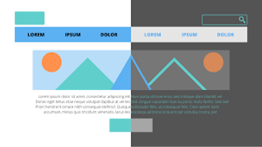
For example, if you have a red button on a green background with low contrast between the two colors, it will be challenging for users to spot the button quickly. On the other hand, if you use high-contrast colors like red and white for the same button on a black background, it will be much easier for users to find and click on it.
In addition to guiding attention, color contrast also affects how users perceive your brand or website. Different colors evoke different emotions and can influence user behavior.
For instance, warm colors like red and yellow are known to stimulate appetite and create a sense of urgency while cool colors like blue and green are associated with calmness and trustworthiness. By using appropriate color contrasts based on your brand's personality or desired emotion from users, you can create a more impactful user experience.
Best Practices for Color Contrast
Now that we understand the importance of color contrast in web design, let's discuss some best practices for using it effectively.
1. Use a High-Contrast Color Scheme
When choosing colors for your website, it's essential to consider their contrast levels. Using high-contrast colors will make your content more accessible and readable, especially for users with visual impairments. It also helps ensure that important elements stand out and are easily identifiable.
2. Consider Color Blindness
Around 8% of men and 0.5% of women have some form of color blindness. This means that they have difficulty distinguishing certain colors from each other. When designing your website, it's crucial to keep this in mind and choose colors with enough contrast to accommodate users with color vision deficiencies.
3. Test Your Colors
Colors can appear differently on various devices and screens, so it's important to test them before finalizing your design. Tools like Adobe Color or WebAIM Contrast Checker can help you determine the contrast ratio between two colors and ensure that they meet accessibility standards.
4. Use Color Contrast to Create Hierarchy
In web design, hierarchy refers to the organization of content based on its importance or significance. By using different levels of contrast between elements, you can create a clear visual hierarchy on your website and guide users' attention accordingly.
5. Be Consistent
Consistency is key in creating a cohesive user experience on your website. This applies to color as well – use a consistent color scheme throughout your site to avoid confusion and create a sense of brand identity.
Conclusion
In conclusion (pun intended), understanding the impact of color contrast on user experience is crucial in creating an effective website design. By using high-contrast colors strategically, considering different forms of color vision deficiencies, testing your colors, using it to create hierarchy, and maintaining consistency throughout your site, you can enhance the user experience and ultimately drive conversions.
At RAD Web Marketing, we understand the importance of color contrast in web design and incorporate it into our digital marketing strategies for clients in North Bay and Napa. Contact us today to see how we can help elevate your brand's online presence through effective web design.


0 Comments