Are you tired of your website looking distorted or unprofessional on different devices? With the rise of mobile usage, it's become more important than ever to have a responsive design website. But did you know that optimizing your images is just as crucial for achieving a seamless and visually appealing experience? In this article, we'll discuss how to optimize images for a responsive design website using CSS Grid, so you can attract and retain visitors on any device.
Understanding Responsive Design and CSS Grid
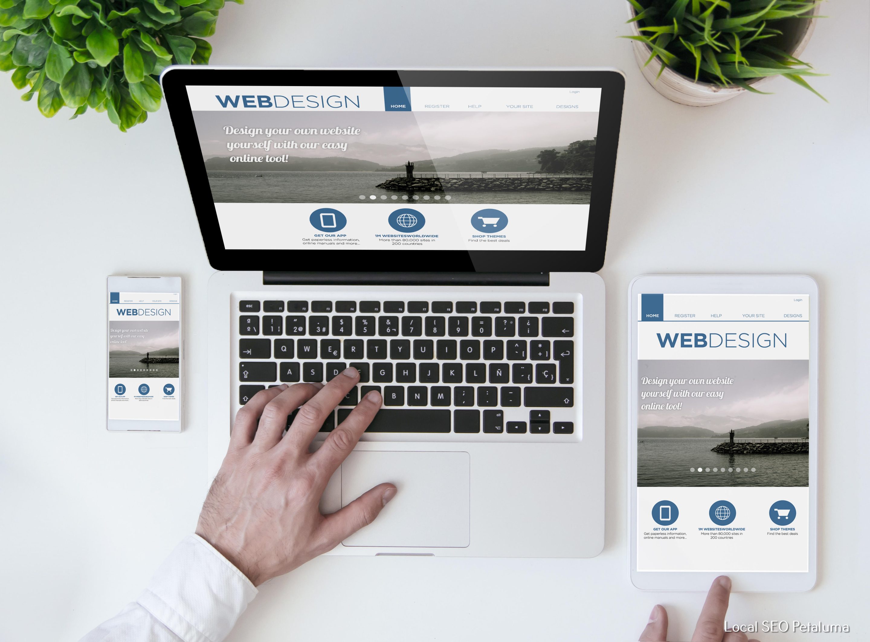
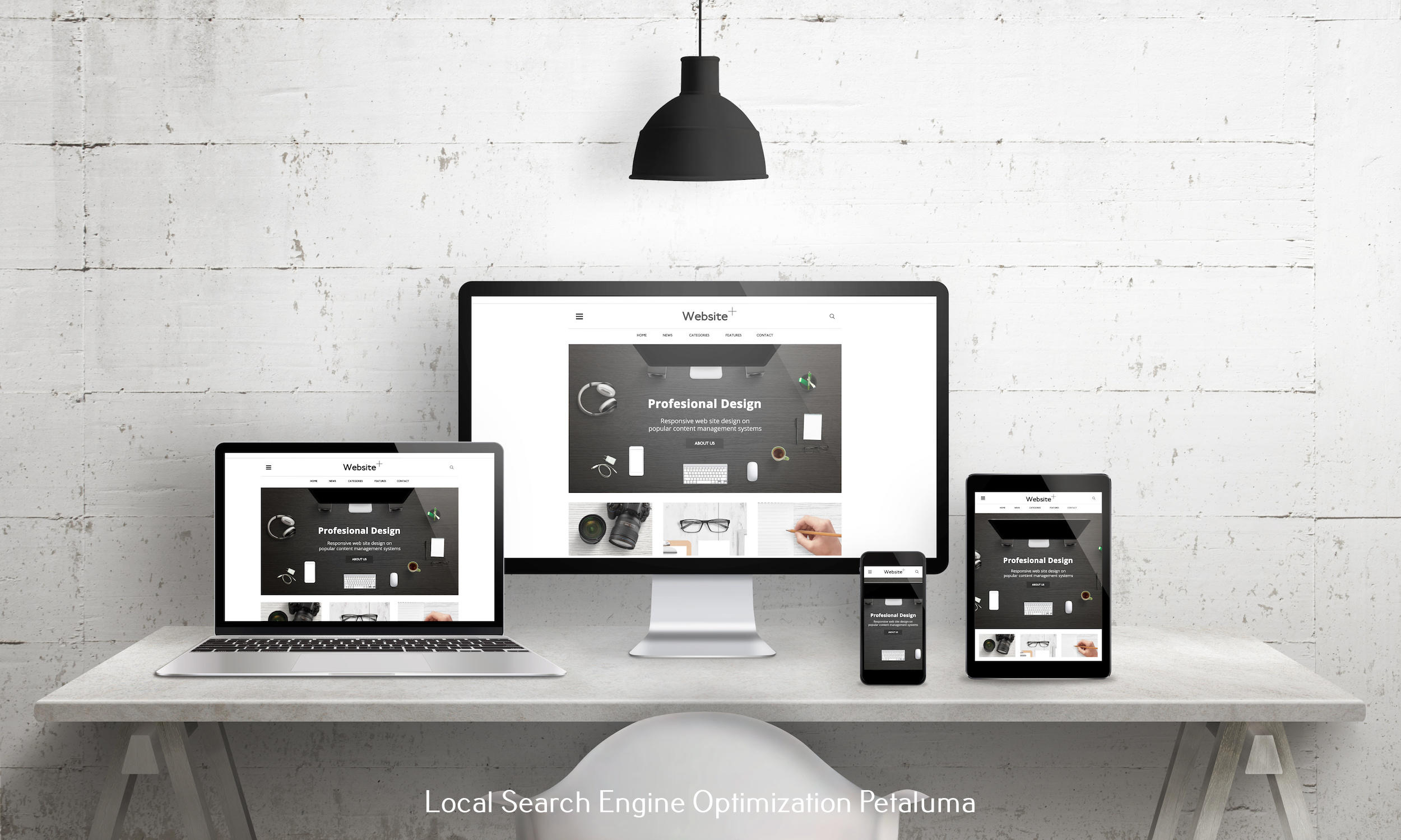
Responsive design is the concept of creating a website that adapts and responds to different screen sizes and devices. This ensures that your site looks great no matter if it's being viewed on a desktop, tablet, or smartphone. While there are many ways to achieve responsive design, CSS Grid has become increasingly popular due to its flexibility and ability to create complex layouts with ease.
Why Optimizing Images is Key in Responsive Design
When it comes to responsive design, images play a crucial role in creating an attractive and functional website. However, large image files can significantly slow down page loading time, which can lead to frustrated visitors who may leave your site before it even loads. Additionally, images that are not optimized for different screen sizes can appear blurry or distorted on certain devices.
By optimizing your images for a responsive design website using CSS Grid, you can ensure fast loading times and high-quality visuals across all devices. This will not only improve user experience but also positively impact your search engine ranking.
How to Optimize Images with CSS Grid
Now let's dive into the steps for optimizing images with CSS Grid:
1) Use Relative Sizing
With traditional web layouts, images are often set at fixed widths or heights. However, in responsive designs using CSS Grid, relative sizing is key. This means setting image widths as percentages instead of pixels so they can adapt to different screen sizes.
For example:
img {
width: 100%;
}
This will ensure that the image will always fill the available space, regardless of the device being used.
2) Utilize Breakpoints
Breakpoints are specific points in your CSS code where you can define different styles for different screen sizes. This is particularly useful for optimizing images on smaller screens. By setting breakpoints, you can adjust image sizes and placement to fit the screen size without losing any important elements.
For example:
@media only screen and (max-width: 768px) {
img {
width: 50%;
float: right;
}
}
This code will make the image half its original size and float it to the right when viewed on a screen with a maximum width of 768px.
3) Consider Image Resolution
Another aspect to keep in mind when optimizing images for different devices is resolution. Retina displays, which have a higher pixel density, are becoming more common. If your website is not optimized for these displays, your images may appear blurry or pixelated.
To ensure high-resolution images on all devices, consider using @2x or @3x versions of your images. These are larger files that will be automatically loaded on retina displays, providing crisp and clear visuals.
4) Use Image Compression Tools
Image compression is a crucial step in optimizing images for responsive design websites. Compression reduces file size without significantly affecting image quality. This results in faster loading times and improved user experience.
There are many online tools available for compressing images, such as Squoosh or TinyPNG. These tools allow you to upload your image and reduce its file size while still maintaining high-quality visuals.
5) Test Your Website
After implementing these steps, it's essential to test your website on various devices to ensure everything looks as intended. You can use tools like Google Chrome's developer tools or services like BrowserStack to see how your site appears on different devices and screen sizes.
In conclusion
Optimizing images for a responsive design website using CSS Grid is crucial for creating a seamless and visually appealing experience for your visitors. By utilizing relative sizing, breakpoints, considering image resolution, using compression tools, and testing your site, you can ensure that your images look great on any device. Remember, in today's digital landscape, a responsive design website with optimized images is key to attracting and retaining visitors and staying ahead of the competition. So why wait? Start implementing these tips today and take your website to the next level!




























0 Comments