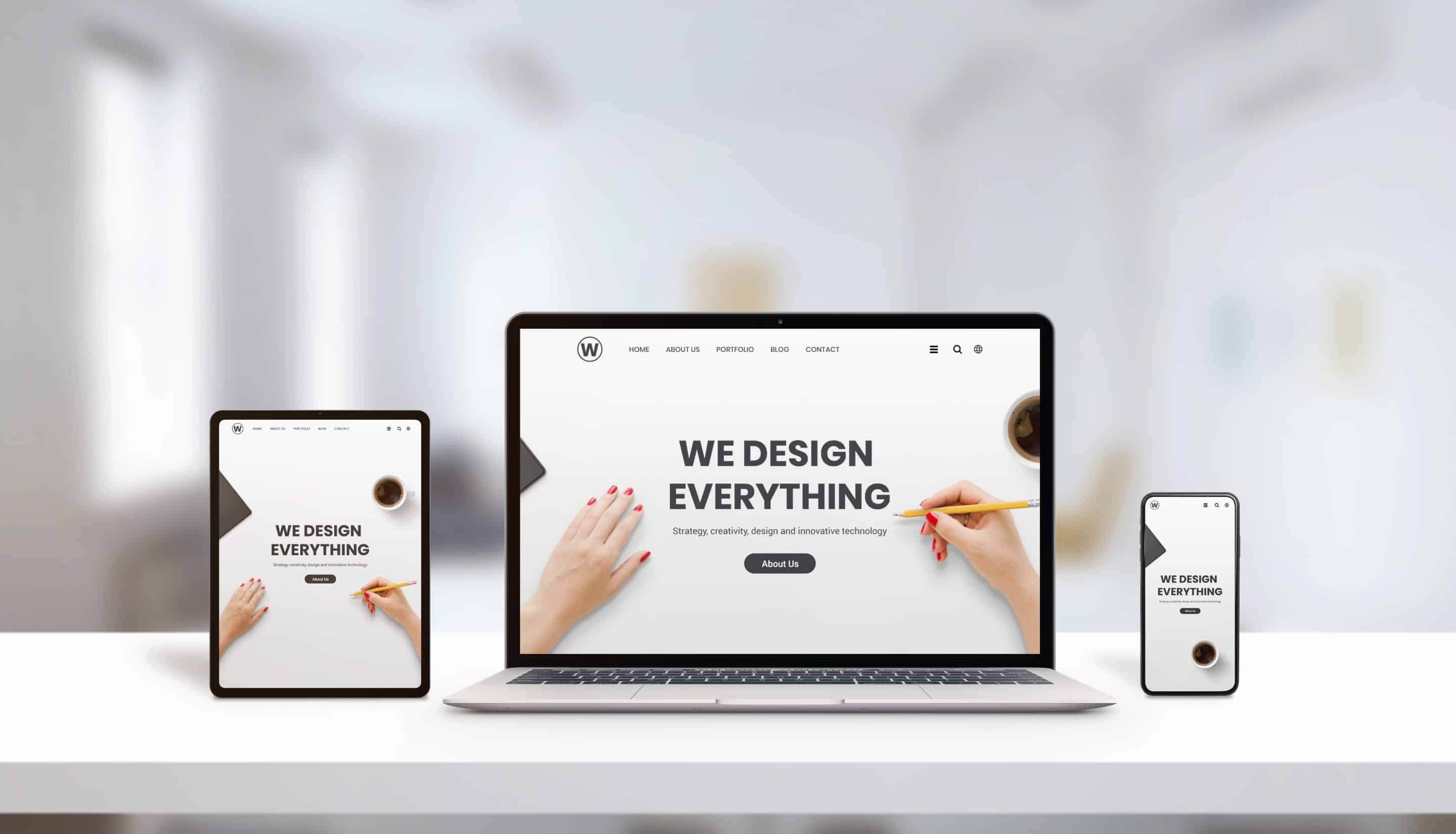
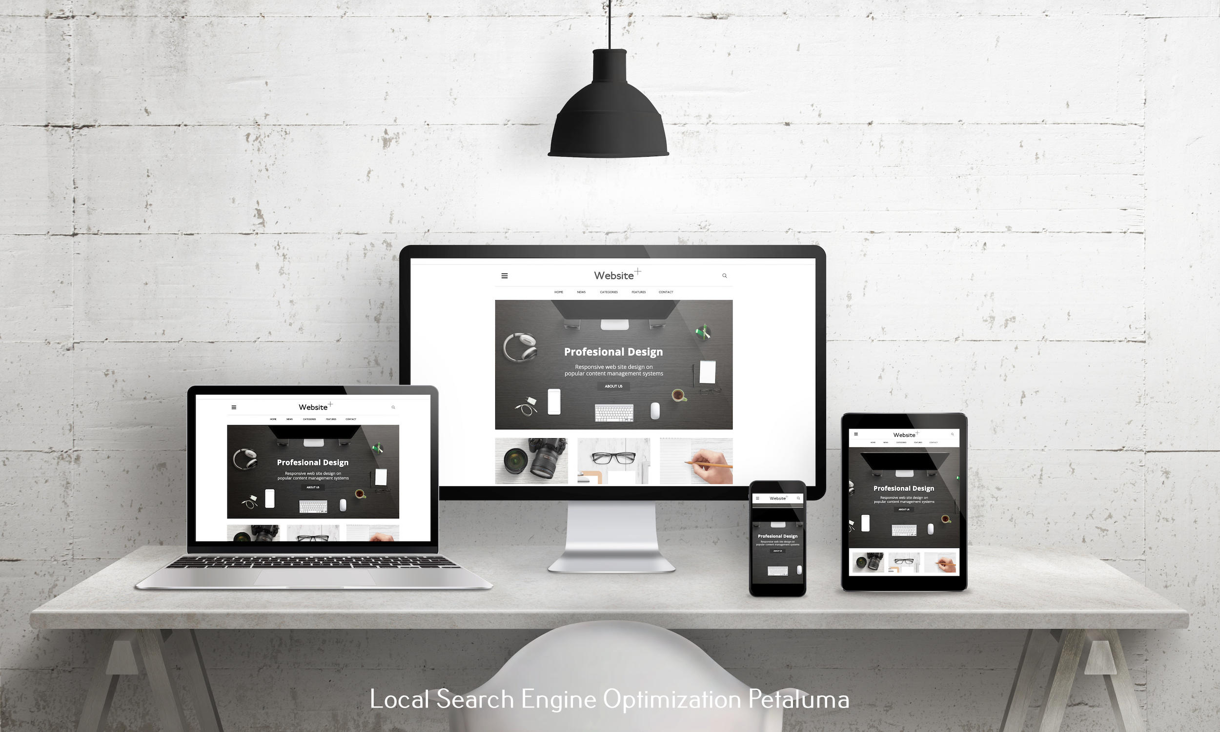
Mobile devices have taken over the world. From smartphones to tablets, people are now accessing the internet more on their mobile devices than on desktops. As a business owner, this means that having a mobile-responsive website is no longer just an option, it's a necessity. But what about your landing pages? Are they also optimized for mobile users? In this article, we'll discuss the best practices and techniques for designing a mobile-responsive landing page.
Understanding Mobile Responsiveness
Before we dive into the best practices and techniques, let's first understand what mobile responsiveness means. Simply put, it is the ability of a website or web page to adapt and display properly on different screen sizes and devices. This includes smartphones, tablets, and desktops. A mobile-responsive landing page adjusts its layout and design elements based on the device being used to ensure a seamless user experience.
Why Mobile Responsiveness Matters
The rise of mobile devices has changed consumer behavior. People now expect to be able to access information quickly and easily from their phones or tablets. If your landing page is not optimized for these devices, you risk losing potential customers who will quickly move on to your competitors' sites.
In addition, Google now prioritizes websites that are optimized for mobile devices in its search engine results pages (SERPs). This means that having a mobile-responsive landing page can also improve your search engine rankings and drive more traffic to your site.
Best Practices for Designing a Mobile-Responsive Landing Page
Now that we understand why having a mobile-responsive landing page is crucial let's explore some best practices for designing one:
1) Keep It Simple: When it comes to designing for smaller screens, less is more. Avoid cluttering your landing page with too much text or images that can make it difficult for users to navigate or read. Stick to essential information and use white space strategically to make your content stand out.
2) Use Large Fonts: Small fonts can be tough to read on mobile devices, so make sure to use a font size of at least 14px. This will ensure that your text is legible and easy to read on any device.
3) Optimize Images: Large images can slow down your loading speed, which can be a major turn off for mobile users. Make sure to optimize your images by compressing them without compromising on their quality.
4) Keep Your Forms Short: Filling out forms on a small screen can be a frustrating experience for users. Keep your forms short and only ask for essential information. You can always collect more details later on through email marketing or other methods.
5) Use Consistent Branding: Your landing page should have the same branding as your website to create a cohesive experience for users. Use the same color scheme, fonts, and logo to maintain consistency across all devices.
Techniques for Designing a Mobile-Responsive Landing Page
1) Implement Responsive Design: The first step in designing a mobile-responsive landing page is using responsive design techniques. This means using fluid grids, flexible images, and media queries to automatically adjust the layout of your page based on the device being used.
2) Test Your Page: It's essential to test your landing page across different devices and screen sizes before launching it. This will help you identify any issues or design flaws that need to be addressed before going live.
3) Use Touch-Friendly Elements: Mobile devices rely heavily on touch navigation, so make sure that all elements on your landing page are touch-friendly. This includes buttons that are large enough for users to tap easily and links that are not too close together.
4) Consider Thumb-Friendly Navigation: Most people hold their phones with one hand while scrolling or tapping with their thumb. So it's essential to design your navigation in such a way that it is easily accessible with just one hand.
5) Utilize Vertical Scrolling: While horizontal scrolling may work well on desktops, it can be frustrating for mobile users. Design your landing page in a way that encourages vertical scrolling to make it easier for users to navigate and consume your content.
In conclusion, having a mobile-responsive landing page is vital for the success of your business. By following these best practices and techniques, you can ensure that your landing page is optimized for all devices and provides a seamless user experience. Remember to keep it simple, use large fonts and optimized images, and test your page before launching it. With these tips in mind, you'll be well on your way to designing a high-converting mobile-responsive landing page that will help grow your business.


0 Comments