

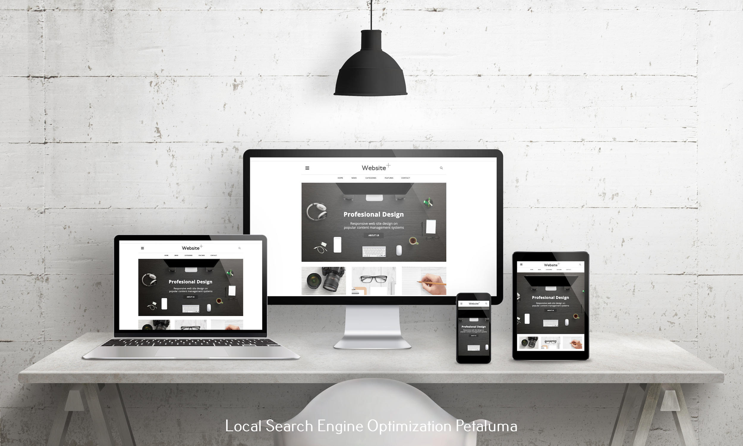


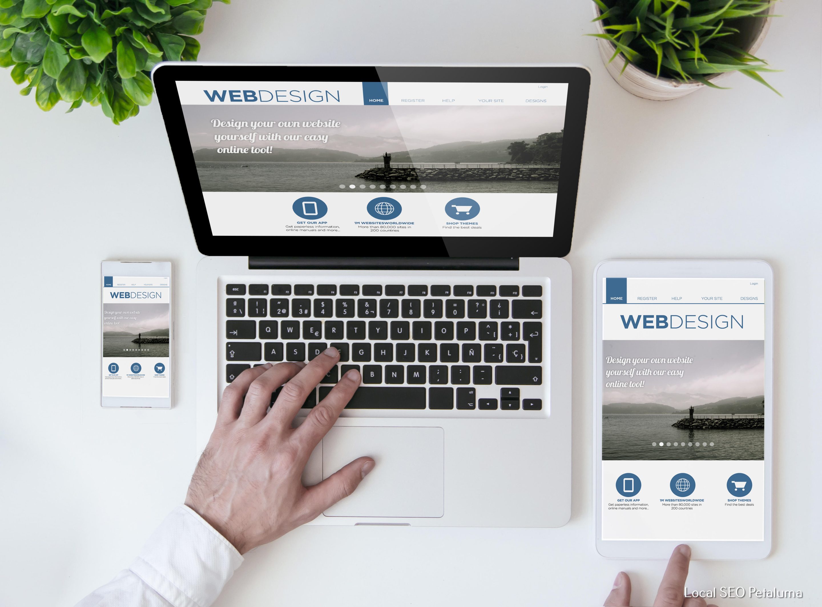

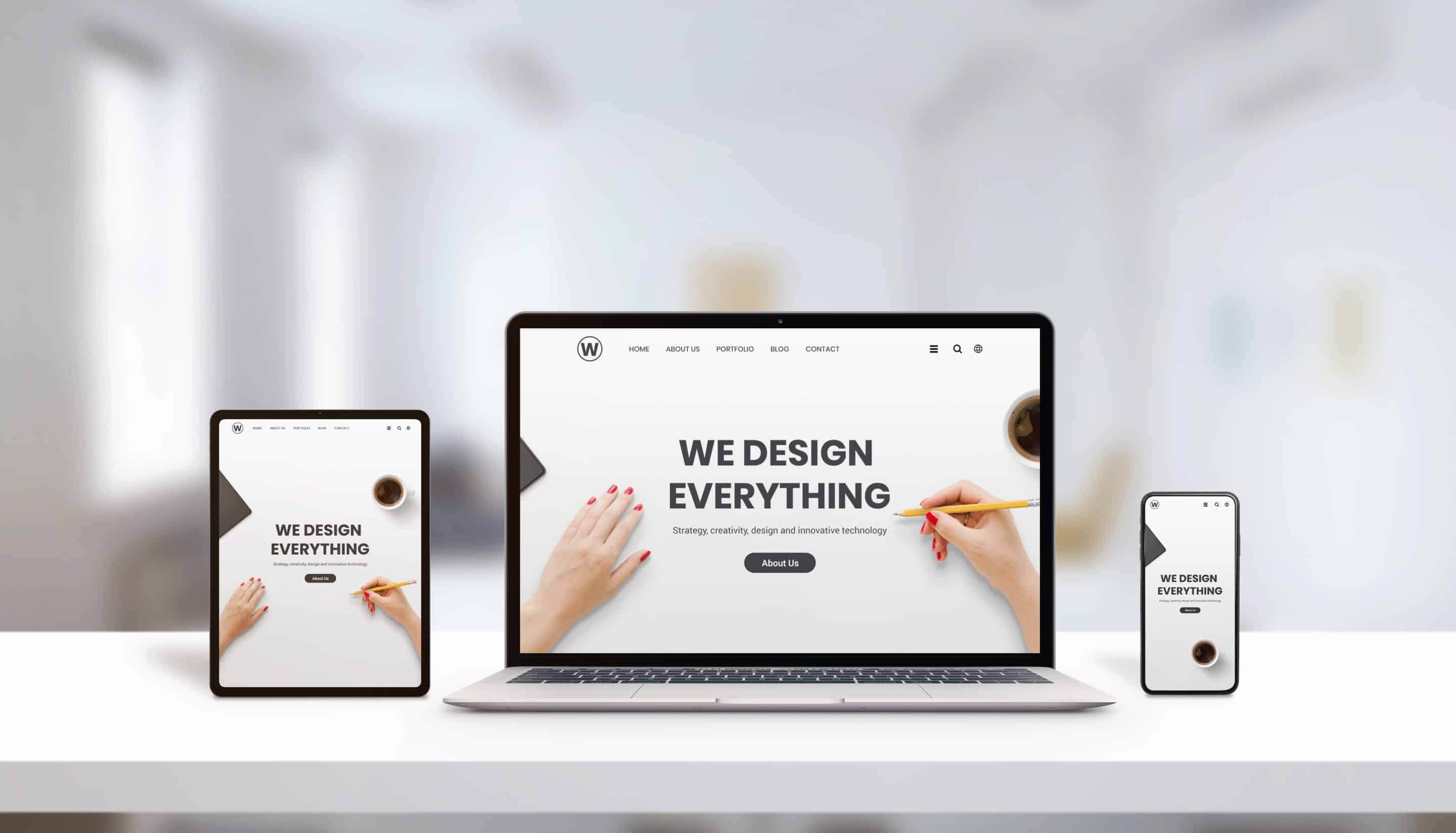


When it comes to website design, navigation is one of the key elements to consider. A website’s navigation structure should be designed to be as intuitive and user-friendly as possible. It should also work with the overall design and purpose of the website, while remaining balanced and organized.
What Is Balanced Website Navigation?
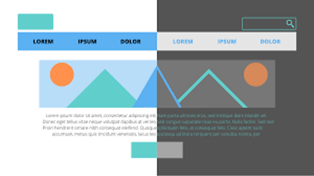
Balanced website navigation is a structure of menus, links, and other navigational elements that provides users with an easy way to find what they are looking for on your site. It should be designed in such a way that users can quickly move from one page or section to another without feeling overwhelmed or confused.
In order for a website’s navigation structure to be balanced, it needs to have both breadth (accessibility) and depth (context). That means it needs enough pages for visitors to navigate through without being too complex or overwhelming. It also needs enough pages within each section so that visitors can explore the content in more detail if they want.
How To Achieve Balanced Website Navigation Structures?
Creating a balanced website navigation structure requires careful planning and consideration of several factors:
Content: The first step in designing balanced website navigation is understanding your content. This includes everything from existing pages on your site (like blog posts and product descriptions) to potential new content you may want to add (like FAQs or contact forms). Knowing what content you have (and don’t have) will help you create an effective navigational structure that makes sense for both visitors and search engines alike.
Structure: Once you know what content you have available, it’s time to start thinking about how it should be structured into menus and sub-menus–this is where the “balance” comes into play! You don’t want too many options cluttering up the menu, but you also don’t want so few options that visitors can’t find what they are looking for easily. Aim for simplicity while still ensuring all necessary information is accessible–if something can fit into an existing menu item, do so instead of creating a new one!
Labels: Your menu items need labels that clearly explain their purpose–longer labels are often better since they provide more context than shorter ones do! Additionally, avoid using vague labels like “info” or “more; instead use terms like “about us” or “contact us” which make it easier for users to understand exactly where those items lead them on your site.
Search Functionality: Including a search bar on your homepage allows users who already know what they are looking for on your site quickly find their desired results without having to click through multiple menus or sub-menus—so adding this feature is highly recommended! Additionally, ensure any internal search engine you use returns relevant results based on relevant keywords—this will save visitors time when searching through large amounts of data on your site.
Visual Cues: Lastly, providing visual cues such as icons or images next to certain key words can help draw attention towards important information more quickly—for example if there is an icon next to ‘contact us' then this might encourage people who need assistance with getting in touch quicker than if there were no icon present at all!
Conclusion
Creating balanced website navigation structures isn't easy – but when done right can significantly improve user experience while also helping boost SEO performance by making sure all relevant information is accessible via easy-to-navigate menus. By considering content availability, structuring menus effectively, labeling items correctly, adding search functionality when needed and including visual cues – you will be well on your way towards achieving optimal web navigation structures!

0 Comments