Mobile usage has skyrocketed in recent years, with more and more people turning to their smartphones for everyday tasks. From checking emails to browsing social media, our phones have become an essential part of our daily lives. As a result, it's crucial for businesses to have a mobile-friendly website that offers a seamless user experience. One of the key elements of a successful mobile website is its navigation.
In this article, we'll discuss the importance of designing mobile-friendly navigation and share some tips and best practices to help you create a user-friendly experience for your customers.
Why is Mobile-Friendly Navigation Important?
Before we dive into the tips and best practices, let's first understand why mobile-friendly navigation is crucial for your website. According to research by Google, 61% of users are unlikely to return to a site on their phone if they had trouble accessing it, while 40% said they would visit a competitor's site instead. This highlights the importance of having a website that is easy to navigate on mobile devices.
Furthermore, with Google's algorithm prioritizing mobile-friendly websites in search results, having an optimized mobile navigation can also boost your SEO efforts. This means that having good navigation not only improves the user experience but can also drive more traffic to your site.
Tips for Designing Mobile-Friendly Navigation
1. Keep it Simple
When it comes to designing navigation for mobile devices, simplicity is key. With limited screen space and smaller touchscreens compared to desktops, users should be able to navigate your site easily without having to zoom in or out constantly.
One way to achieve simplicity is by using hamburger menus – those three horizontal lines that expand into a menu when clicked on. This keeps the main menu hidden until needed and allows for more space on the screen for content.
2. Use Iconography
Icons are another great way to make your navigation more intuitive on smaller screens. Instead of using long text labels that may not fit on a mobile screen, icons can convey the same message in a more compact and visually appealing way.
However, it's essential to use universally understood icons to avoid confusion. For example, using a magnifying glass for search or a shopping cart for the shopping cart page.
3. Prioritize Important Pages
When designing your mobile navigation, it's crucial to prioritize the most important pages of your website. This means placing them at the top of your navigation menu or in a prominent position on your homepage.
For example, if you're an e-commerce website, you may want to prioritize your “shop” or “products” page. If you're a service-based business, your “services” page should be easily accessible.
4. Utilize Drop-Down Menus
Drop-down menus are an excellent way to organize and display subcategories within your navigation menu while keeping the overall design simple and clutter-free. However, when using drop-down menus on mobile devices, make sure they are easy to tap and don't require too much scrolling or zooming.
5. Use Search Functionality
Including a search function in your mobile navigation can make it easier for users to find what they're looking for quickly. This is especially useful for websites with large amounts of content or products.
Make sure that the search bar is prominently displayed and easily accessible from any page on your site. Additionally, consider using predictive text or autocomplete functionality to help users find their desired results faster.
Best Practices for Designing Mobile-Friendly Navigation
1. Use Responsive Design
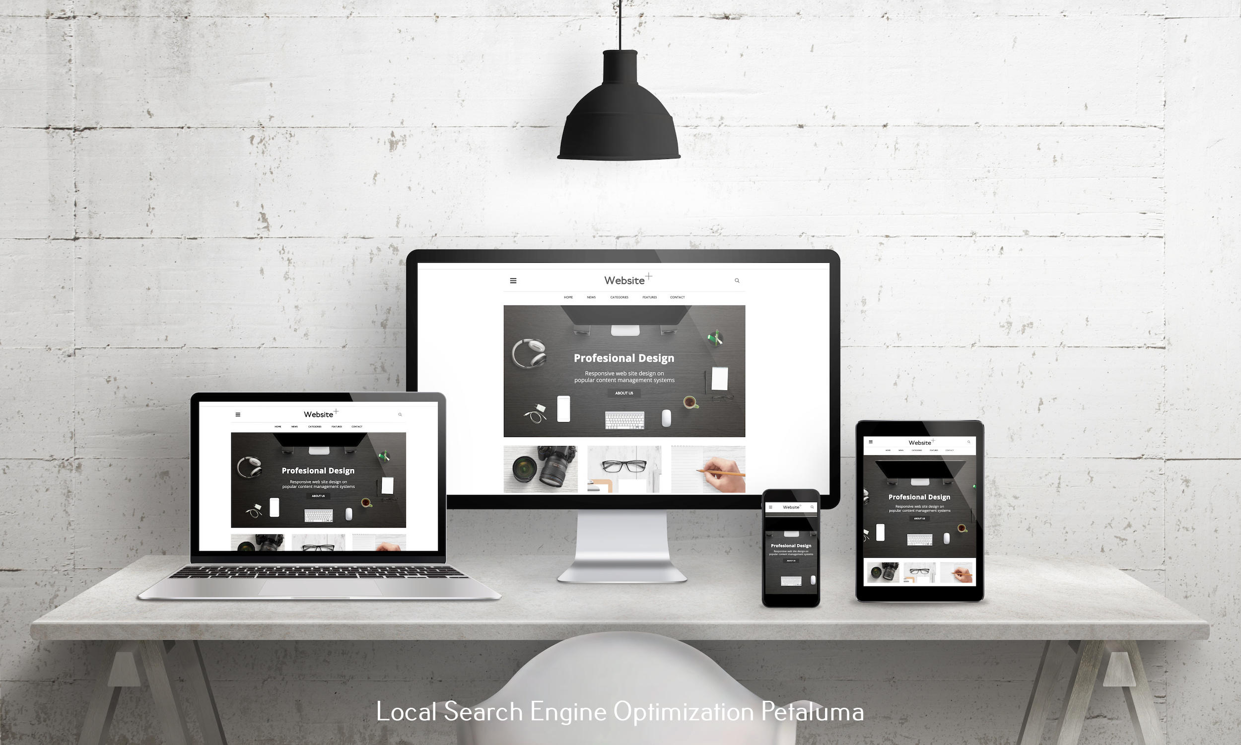
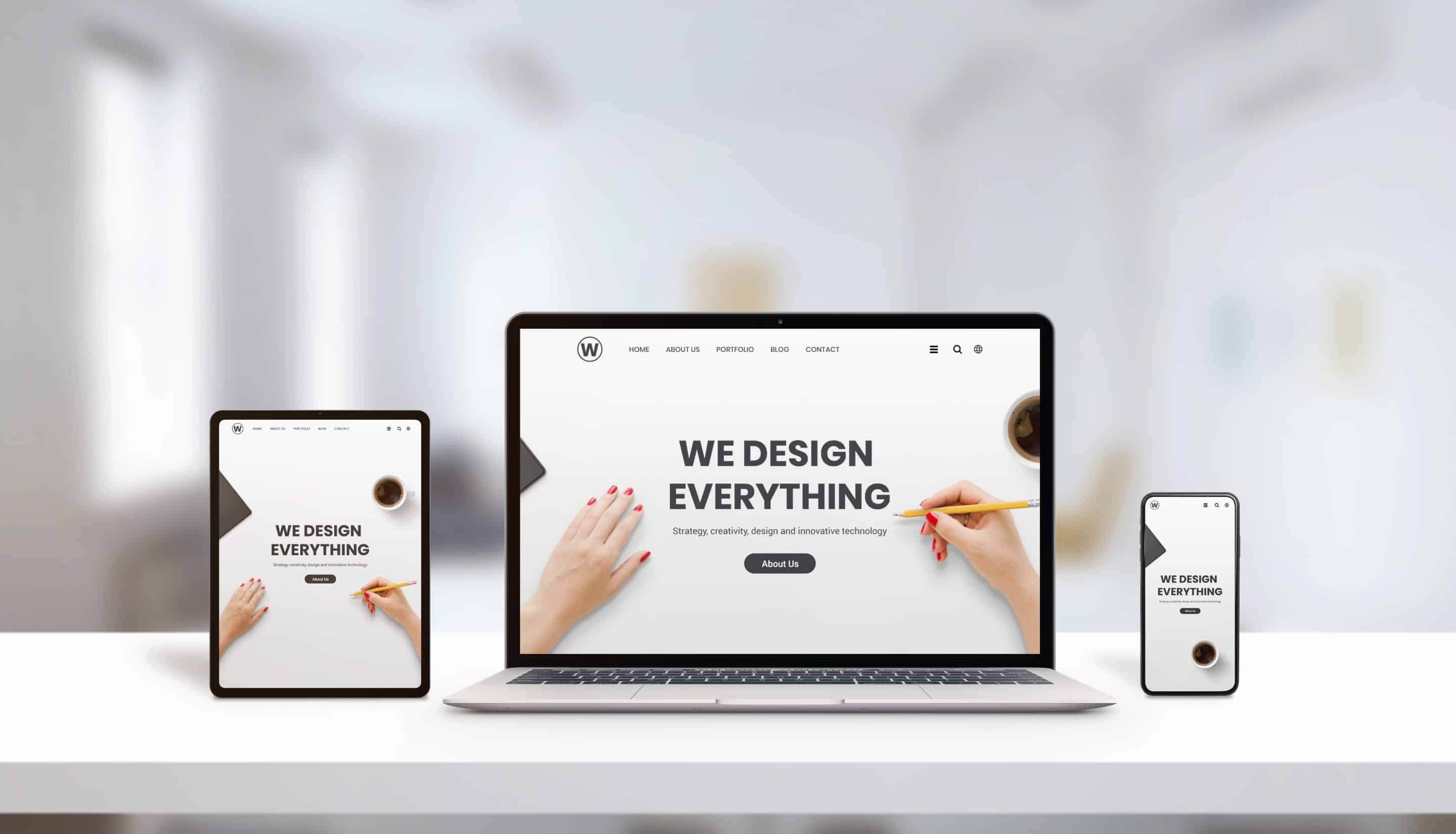
Responsive design is crucial when it comes to creating a user-friendly experience across all devices – including mobile devices. With responsive design, your website will adjust automatically based on the size of the user's screen, ensuring that all elements are visible without any need for resizing or scrolling.
2. Keep Consistent Design Elements
Consistency is key when designing mobile-friendly navigation. Make sure that your navigation menu is consistent throughout all pages on your website. This means using the same icons, colors, and layout to avoid confusion and create a seamless user experience.
3. Test and Optimize
It's essential to test your mobile navigation on different devices and screen sizes to ensure that it works smoothly. Additionally, regularly reviewing and optimizing your navigation based on user behavior can help improve the overall user experience.
In Conclusion
Designing mobile-friendly navigation is crucial for creating a positive user experience and driving more traffic to your website. By keeping things simple, utilizing iconography, prioritizing important pages, utilizing drop-down menus, and using search functionality – along with following best practices such as responsive design, consistency, testing, and optimization – you can create an intuitive and user-friendly mobile navigation for your customers. Remember to constantly review and update your navigation based on user feedback to ensure that it continues to meet their needs.


0 Comments