

Does Mobile Responsive Web Design Always Mean a Better User Experience?
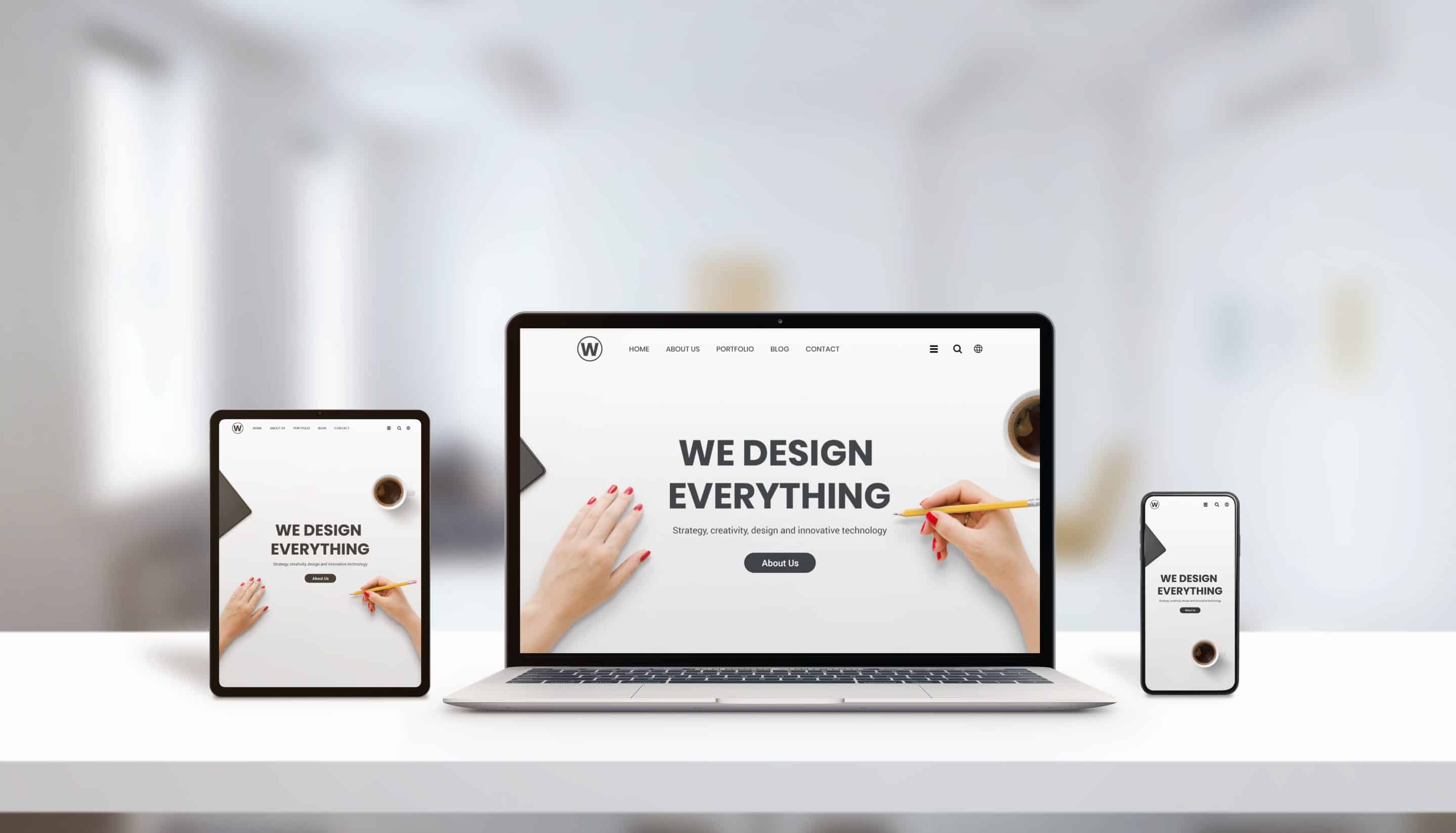
No, having a mobile responsive web design does not always guarantee a better user experience for small businesses. While it helps your site adjust to different screen sizes, it can still fall short if the content, navigation, or overall website strategy is not tailored to your actual customers’ needs.
Most business owners choose a responsive design to make sure their site works on phones and tablets. This is important, since over half of all website visits happen on mobile devices. But simply shrinking and stacking your content isn’t enough. If your site loads slowly, hides important contact information, or is hard to navigate with a thumb, visitors may leave quickly. For small businesses struggling with outdated layouts, a website redesign can address both mobile responsiveness and usability issues to create a more engaging experience for visitors. Regular website maintenance is essential to ensure that your mobile responsive design continues to function smoothly across new devices and browsers, providing a consistent experience for your customers. Partnering with an experienced digital agency can help small businesses identify and fix web design flaws that often undermine the effectiveness of mobile responsive sites. For small businesses targeting primarily mobile users, investing in mobile-first website design can help ensure that essential features remain accessible and visually appealing across all devices.
For example, a local bakery’s responsive site might look fine on a phone, but if the daily specials are buried behind tiny menus, customers can’t easily find what they’re looking for. Or, a plumber’s contact form could be difficult to fill out on a small screen, even though the layout technically “responds” to the device. While mobile responsive design is important, focusing on local seo can help small businesses attract nearby customers and improve their overall online visibility regardless of device.
The right approach is to think about what your mobile visitors actually want to do. Are they looking for your phone number? Directions? A quick menu? If your responsive design doesn’t make those things simple, the user experience suffers — no matter how “modern” your site looks.
For further reading, see Responsive web design from developer.mozilla.org.
What Can Go Wrong with a Mobile Responsive Website for Small Businesses?
Several common problems can make a mobile responsive website frustrating for your customers instead of helpful. These issues often come up when businesses rely only on automated design tools or generic templates.
- Poor Navigation: Menus and buttons can become too small or hidden, making them hard to use on a phone.
- Buried Contact Info: Essential details like your phone number or address might be hard to spot on mobile layouts.
- Slow Load Times: Large images or extra scripts designed for desktops can slow down your site on mobile networks.
- Popups That Don’t Scale: Popups or overlays may cover the whole screen or be impossible to close on mobile devices.
- Unreadable Text: Fonts can shrink too much, forcing users to zoom in and out just to read your content.
- Features That Don’t Work: Things like booking tools, maps, or payment forms may break or be hard to use on touchscreens.
- Navigation Fatigue: If users have to scroll endlessly or tap through too many screens, they often give up.
A real-world example: A restaurant’s desktop site may have a beautiful photo gallery, but on mobile, those images load slowly, and the “Call Now” button disappears behind a menu. This can cost you business, especially with local customers who want quick answers.
How Does Mobile Responsive Web Design Affect Local Customers Differently?
Mobile responsive design can help local customers, but only if it’s built with their specific needs in mind. Local users often visit your site because they need fast details — such as your address, hours, or a phone number — right now, often while on the go.
For small businesses, your mobile site should focus on:
- Making the phone number and address easy to find and tap
- Highlighting business hours up front
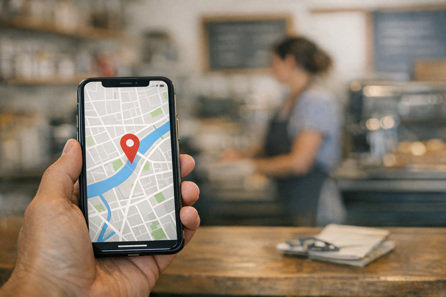
- Providing directions with a single tap
- Allowing quick access to menus, services, or booking
If your responsive site hides these key points behind multiple clicks or slow-loading images, you risk losing local leads. For example, a Petaluma coffee shop may have a responsive website that looks nice, but if a customer can’t easily click for directions while driving, they may choose a competitor instead.
Think about how people in your area actually use their phones. Are they looking for a last-minute appointment? Trying to check tonight’s specials? A responsive design that misses those local habits isn’t really helping your business.
Why Fast Load Times Are Not Guaranteed by Mobile Responsive Design
Responsive design does not automatically make your site load quickly on mobile. Load speed depends on much more than just layout — it’s affected by images, scripts, and other behind-the-scenes factors.
- Oversized Images: Many responsive sites simply shrink desktop images for mobile, but still load the full, large files — slowing things down.
- Too Many Scripts: Features like sliders, popups, or tracking codes can load on every device, even if they aren’t needed on mobile.
- Unoptimized Fonts: Using too many custom fonts can add extra load time, especially on slow connections.
- External Widgets: Embedded maps, chat tools, or video players can drag down performance.
- No Caching: If your site doesn’t store some information locally on the device, it may reload everything from scratch each time.
Consider a local salon’s website: It might look fine on a phone, but if the homepage includes a full-width slideshow with high-resolution images, mobile users may wait several seconds for it to load. Most people won’t stick around that long — especially if they’re looking up your business while traveling or in a hurry.
RAD Web Marketing often recommends compressing images and removing unnecessary scripts for any small business site. This helps make sure your responsive site is also a fast one.
Is Mobile Responsive Design Enough to Meet Accessibility Needs?
No, mobile responsive design alone does not ensure your website is accessible for everyone. Accessibility means people with disabilities can use your site easily — and that often requires extra effort beyond simply resizing content for smaller screens.
- Poor Contrast: Some responsive templates use color combinations that are hard to read for those with vision issues.
- Missing Text Alternatives: Images without descriptive text (“alt text”) can’t be understood by screen readers.
- Buttons Too Small: Touch targets need to be large enough for people with limited mobility to tap accurately.
- Navigation by Keyboard: Some users can’t use a mouse or touchscreen and need to navigate with a keyboard.
- Non-Descriptive Links: Phrases like “Click here” don’t tell screen readers what will happen or where the link goes.
For example, a responsive site for a local accountant might look great on a phone, but if the contact form labels disappear or the color scheme is too light, it becomes unusable for clients with low vision or those relying on screen readers. True accessibility means thinking about all your customers, not just those on the latest smartphones.

How Can Content Strategy Undermine a Responsive Web Experience?
Your content strategy can make or break the mobile experience, even with the best responsive design. If your content is too wordy, disorganized, or not tailored to mobile users, people may leave your site without taking action.
- Long Paragraphs: Walls of text are overwhelming on small screens and may cause visitors to stop reading.
- Buried Calls-to-Action: If your “Book Now” or “Call Today” buttons are hidden far down the page, users may never see them.
- Desktop-First Content: Content written for large screens (like multi-column layouts or wide tables) doesn’t always translate to mobile.
- Too Many Choices: Overloading mobile users with too many links or options can lead to decision fatigue.
- Irrelevant Details: Mobile users often want quick answers, not your full company story on the homepage.
Take a local gym’s website: If the class schedule is only available as a downloadable PDF meant for desktops, mobile users may not be able to read it at all. Or, if your about page is five scrolls long on a phone, people may never find your contact details.
Effective mobile content should be concise, focused, and put the most important information at the top. RAD Web Marketing helps businesses in Petaluma and beyond rethink their content for real-world mobile use.
When Does Mobile Responsive Web Design Fail to Support Business Goals?
Responsive design fails to support your business when it does not drive the actions you want from your customers. A site that looks good on every screen does not help if it doesn’t encourage calls, bookings, sales, or visits to your location.
For example, if you run a service business but your mobile site hides the “Request a Quote” button in a menu, you may lose leads. Or, if you operate a retail shop and your directions link is hard to find, fewer people may walk through your door.
This often happens when businesses use a one-size-fits-all template without thinking about their unique goals. Every business is different. A dentist’s site should make it easy to book an appointment, while a food truck’s site should highlight its current location and hours right away.
Ask yourself: What do you want most from your visitors? If your mobile experience doesn’t make that action obvious and easy, even the most technically responsive design isn’t supporting your bottom line.
What Extra Steps Can Small Businesses Take Beyond Responsive Design?
To truly deliver a strong mobile experience, you need to go beyond just making your site responsive. Here are practical steps you can take:
- Test with Real Customers: Watch people try to use your site on different devices. See where they get stuck.
- Prioritize Key Actions: Put your phone number, address, or main calls-to-action in easy-to-tap spots at the top.
- Optimize Images and Scripts: Compress photos and remove unnecessary features that slow down loading on mobile networks.
- Streamline Content: Cut down on long paragraphs and highlight only what mobile users need most.
- Check Accessibility: Use tools like screen readers and keyboard navigation to make sure your site works for everyone.
- Localize for Your Area: Add features like “Tap to Call” or direct links to maps if you serve local customers.
- Update Regularly: Review your site often to make sure it still fits your business goals and customer habits.
Many business owners in Petaluma have improved their mobile results by taking these steps, often with help from a local digital marketing company like RAD Web Marketing. Small changes can have a big impact on how many leads and sales your site brings in.
How to Evaluate If Your Mobile Responsive Web Design Delivers Real Value
You can check if your mobile site delivers value by focusing on a few key areas. Don’t just assume it works because it “looks okay” on your phone. Use these approaches to get a real sense of your site’s performance:
- Check Analytics: Review data to see how many people visit on mobile — and how many leave quickly (bounce rate).
- Test Major Actions: Try booking an appointment, calling your business, or finding your address on several devices.
- Gather Customer Feedback: Ask real customers if they found what they needed quickly and easily.
- Monitor Load Times: Use free tools to see how fast your site loads on mobile networks (not just WiFi).
- Track Conversions: Measure how many visitors take your desired action (calls, bookings, purchases) from mobile versus desktop.
- Review Accessibility: Use online checkers to see if your site works for people with disabilities.
- Compare to Competitors: See how your mobile site stacks up to others in your area or industry.
Making these checks a regular part of your website management helps you spot problems before they cost you customers. If you discover that users are dropping off or not taking action, it’s time to refine your strategy.
If you want expert advice on how to turn your mobile site into a real asset for your business, call RAD Web Marketing at 707-205-3600. We help businesses in Petaluma and beyond create websites that really work for their customers — on every device.

Frequently Asked Questions
Does having a mobile responsive website guarantee a good user experience?
No, a mobile responsive website doesn't automatically guarantee a good user experience. While it ensures your site fits different screen sizes, your site also needs clear navigation, fast loading times, and easy access to key information to truly satisfy visitors.
What are common issues small businesses face with mobile responsive web design?
Common issues include slow load times, hard-to-find contact details, and menus that are difficult to use on smaller screens. To avoid these problems, make sure your most important information and actions are easily accessible for mobile users.
How can I improve my business website’s mobile experience beyond just being responsive?
Focus on what your mobile visitors are most likely to need, such as your phone number, directions, or a quick menu. Simplify navigation, keep forms short, and make sure buttons are easy to tap with a finger for a smoother user experience.
What should I prioritize when designing a mobile site for my small business?
Prioritize fast loading, easy-to-find contact info, and intuitive navigation for mobile users. RAD Web Marketing recommends putting your customers’ top needs front and center, so visitors can quickly find what matters most to them.
Can RAD Web Marketing help fix problems with my mobile web design?
Yes, RAD Web Marketing can help you identify and fix mobile usability issues on your business website. Reach out to their team in Petaluma, CA, for expert advice and practical solutions tailored to your customers’ needs.





































0 Comments