

The use of color in web design is more than just an aesthetic choice; it's a strategic decision that significantly impacts user experience and readability. Understanding and implementing color theory can elevate your website's design, making it not only visually appealing but also more functional. In this article, we'll explore the power of contrast and how you can use color theory to improve readability in web design. You'll gain insights into choosing the right colors, the importance of contrast, and practical tips for applying these concepts to enhance user engagement.
The Basics of Color Theory in Web Design
Color theory is a framework that designers use to understand how colors interact and the effects they have on viewers. By mastering this theory, you can create a cohesive and inviting visual experience for your users. The color wheel is a fundamental tool in color theory, illustrating the relationships between primary, secondary, and tertiary colors. Understanding these relationships allows designers to make informed decisions about color schemes that resonate with their audience.
For example, complementary colors—those opposite each other on the color wheel—create high contrast and can be used to draw attention to key elements on a page. Conversely, analogous colors, which are next to each other on the wheel, provide a more harmonious and less jarring experience. When choosing a color scheme for your website, consider the emotions and associations each color evokes. Blue, for instance, often conveys trust and professionalism, making it a popular choice for corporate websites.
Implementing color theory in your web design can also support visual brand consistency. By selecting a palette that aligns with your brand's identity, you reinforce your message and improve brand recognition. This approach is particularly useful when integrating elements like custom logo design and other digital graphic design components, ensuring a unified look across all platforms.
The Importance of Contrast for Readability
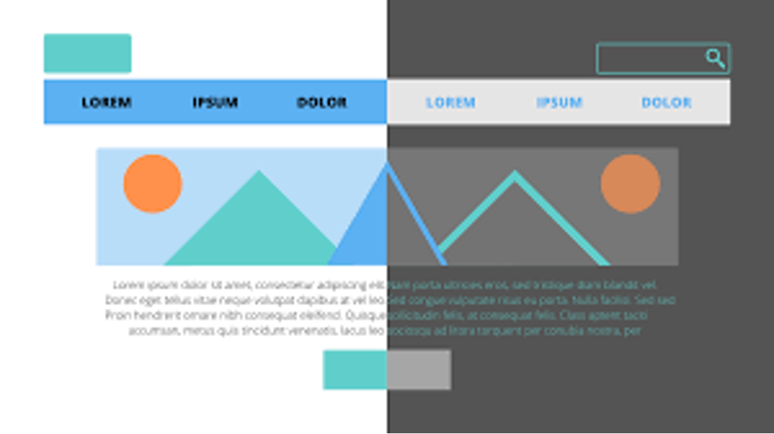
Contrast plays a crucial role in web design, particularly when it comes to readability. Without sufficient contrast, text can become difficult to read, leading to a poor user experience. High contrast between text and background colors ensures that content is accessible to all users, including those with visual impairments.
One way to achieve this is by using dark text on a light background or vice versa. This simple technique can dramatically improve readability and is a staple in effective website redesign strategies. For example, many professional logo design services emphasize high contrast to ensure logos are easily recognizable and versatile across different mediums.
Moreover, contrast isn't limited to text and background colors. It also applies to other elements such as buttons, navigation menus, and call-to-action sections. By ensuring these elements stand out, you guide users through your site more effectively, enhancing overall usability. When planning a website redesign, consider contrast as a key factor in your UX optimization services to improve website usability.
- Use a color contrast checker tool to ensure sufficient contrast ratios.
- Test your design in grayscale to evaluate contrast without the distraction of color.
- Consider users with color blindness by avoiding color combinations that may be indistinguishable.
Practical Applications of Color Theory in Web Design
Implementing color theory effectively requires a strategic approach. Start by defining the purpose of your website and the message you want to convey. Once you have a clear understanding, you can select colors that align with your goals. For instance, a website focused on health and wellness might use greens and blues to evoke feelings of calm and vitality.
Custom graphic design plays a vital role in bringing your color strategy to life. By working with experienced graphic design services, you can ensure your visual elements are cohesive and compelling. These services can help create a color palette that not only enhances readability but also strengthens your brand identity.
Consider the context in which your design will be viewed. Different devices and lighting conditions can affect how colors are perceived. Testing your design on multiple devices and under various lighting conditions can help ensure consistent readability and visual appeal.
- Choose colors that reflect your brand's personality and values.
- Ensure your design is adaptable to different screen sizes and resolutions.
- Utilize white space effectively to prevent visual clutter and enhance focus.
Advanced Tips for Using Contrast and Color
As you become more comfortable with color theory, you can experiment with advanced techniques to further improve your web design. One such technique is the use of accent colors to highlight specific areas or actions on your site. Accent colors should contrast with your primary palette to draw attention without overwhelming the viewer.
Another strategy is to use color psychology to influence user behavior. Warm colors like red and orange can create a sense of urgency, making them effective for call-to-action buttons. Cooler colors like blue and green can convey tranquility and trust, suitable for content-heavy sections that require user focus.
Lastly, consider the role of color in accessibility. Incorporating features like adjustable contrast settings can make your website more inclusive. Providing users with the ability to customize their viewing experience can greatly enhance accessibility and user satisfaction.
- Use accent colors sparingly to avoid distraction.
- Experiment with different color combinations to find what works best for your audience.
- Incorporate user feedback to refine your color strategy over time.
Conclusion
Understanding and applying color theory in web design is a powerful way to enhance readability and user engagement. By focusing on contrast and selecting appropriate color schemes, you create more accessible and visually appealing websites. Whether you're embarking on a website redesign or refining your digital graphic design strategy, prioritizing readability through effective color use is essential. As you implement these insights, consider how they align with your overall branding and design goals to maximize impact and user satisfaction.


0 Comments