

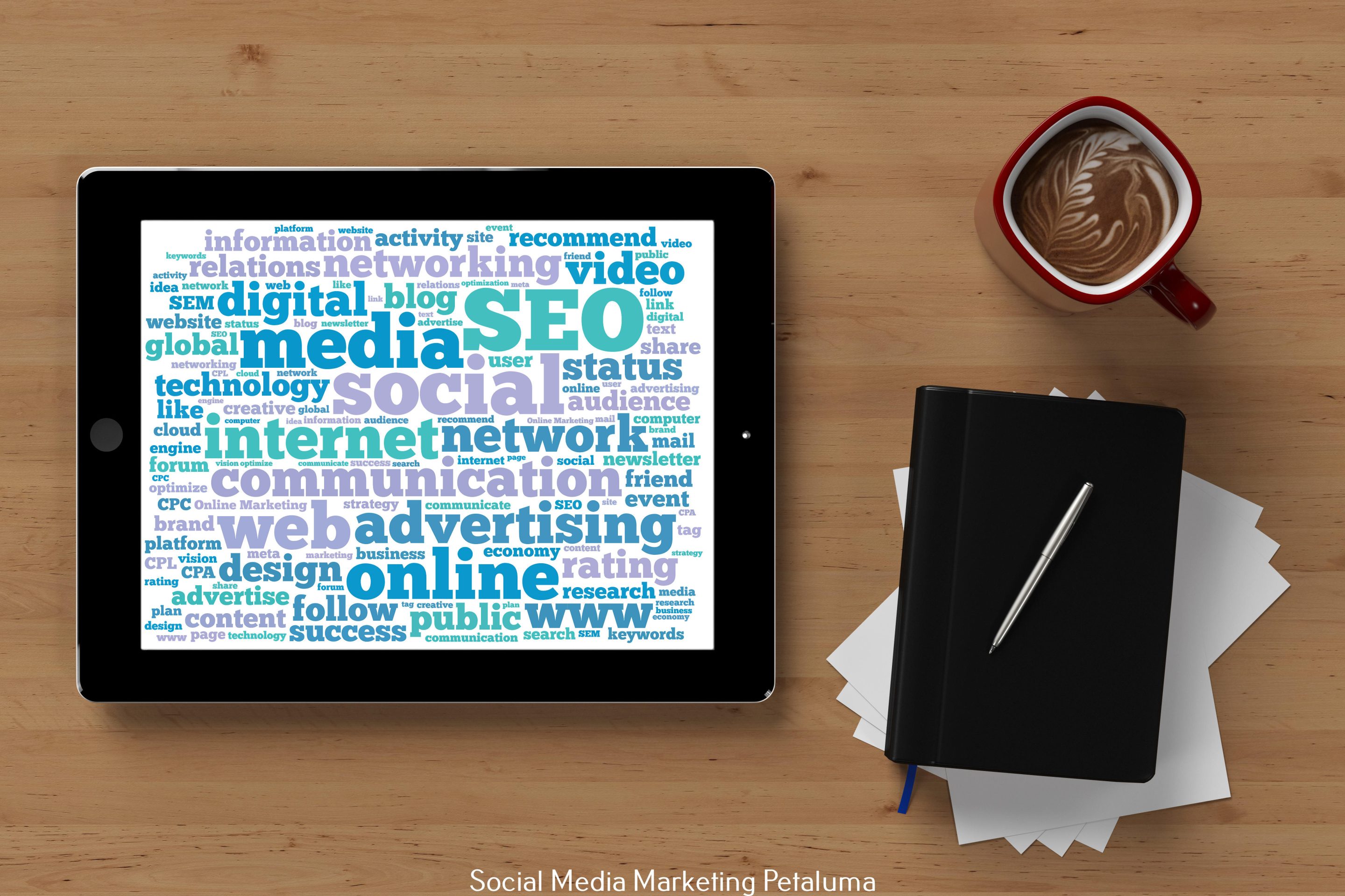
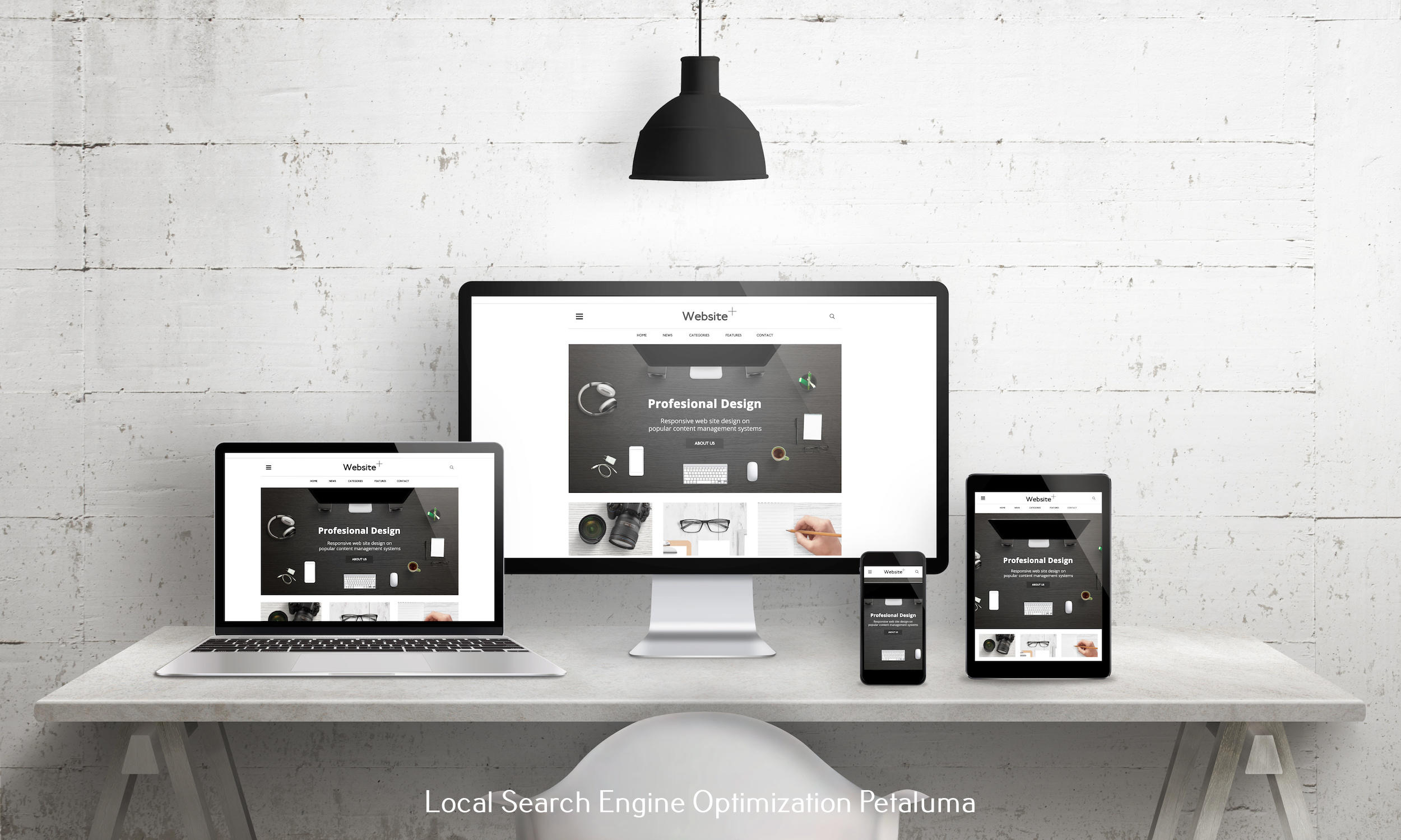
When visitors land on a website, their reactions are almost instant—and largely subconscious. Subtle choices in color, spacing, and typography can determine whether someone feels confident moving forward or leaves the page without a second thought. For businesses in Petaluma and across the North Bay, web design isn’t just about aesthetics—it’s about guiding behavior, building credibility, and supporting growth. RAD Web Marketing helps organizations create websites that not only look professional but drive real, measurable outcomes by aligning design with human behavior.
Business owners and marketing managers often struggle to turn traffic into qualified engagement. Many don’t realize that low conversion rates, user hesitation, or poor retention may be rooted in design decisions like inconsistent typography, unbalanced spacing, or clashing colors. These issues can lead to higher bounce rates, diminished trust, and lost visibility in search results. At RAD Web Marketing, a well-known web design agency in Petaluma, we apply proven design strategies informed by performance data to help brands create experiences that support user confidence and drive results. This article breaks down how color, space, and typography function not just as design elements—but as tools that directly influence user action.
The Role of Color in Web Design
Color shapes users’ impressions and emotional responses before they read anything. It communicates mood, creates emotional responses, and influences how people feel about a brand or product. Within moments of visiting a website, users form impressions that shape whether they feel comfortable staying or compelled to act. According to research from the Institute for Color Research, people make a judgment about a product or experience within 90 seconds, and as much as 90% of that decision is based on color alone. For businesses, this means that color selection directly affects how users interpret trustworthiness, value, and relevance.
Choosing the right color palette is not a matter of preference—it’s a matter of function. Each color choice contributes to how users engage with a brand, particularly when paired with layout, imagery, and typography. Color combinations can guide the eye to high-value actions, create contrast that improves readability, and reinforce emotional consistency throughout a site. When done right, color doesn’t just match a logo; it reinforces the brand’s position in the market and helps support specific user behaviors like clicking a button, submitting a form, or completing a purchase.
Color Psychology in Web Design Choices
- Red: Triggers urgency and draws attention, often used in clearance tags, countdown timers, or purchase buttons. Effective for encouraging quick decision-making.
- Blue: Associated with reliability and professionalism. Frequently used by financial institutions, healthcare organizations, and SaaS platforms where stability and trust are priorities.
- Green: Connects with themes of balance, wellness, and sustainability. A strong fit for businesses in natural products, environmental services, or health and nutrition.
- Yellow: Conveys energy and alertness. Best used to highlight key areas or temporary messages, as overuse can create visual fatigue or cause tension.

Choosing the Right Palette
- Align color choices with your brand’s personality and audience expectations.
- Use colors strategically to reflect tone—luxury brands may use muted tones, while family or youth-focused brands benefit from bright, welcoming hues.
- Avoid using too many colors. A balanced palette typically includes three main colors and one or two accent shades.
- Keep the visual experience consistent across all pages by applying the same color logic throughout the site.
- Use contrast to improve readability and draw attention to important elements like calls-to-action, headlines, or key links.
- Ensure your palette supports a clear visual hierarchy, helping users focus and navigate with less effort.
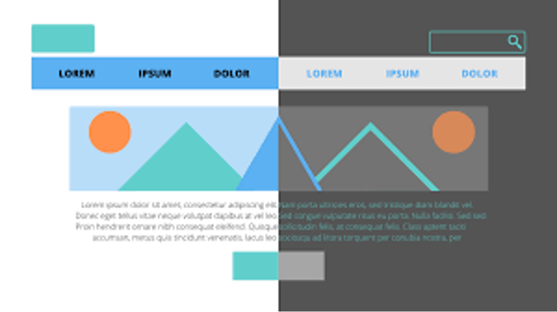
Contrast and Readability
High contrast between background and text is essential for readability and accessibility. For instance, while light pastel tones on white may appear clean and modern, they often cause users to strain their eyes or miss key content altogether—especially on mobile devices. Consistent, high-contrast color pairings help guide attention and support users with varying levels of vision.
At RAD Web Marketing, color selection is not based solely on brand aesthetics; it’s guided by how color contrast influences perception, trust, and user behavior. A well-balanced contrast ratio can lead to stronger engagement, while poor contrast contributes to bounce rates and missed conversions. As a web design agency, our web designers meticulously curate color schemes that reflect your brand identity while making a profound emotional impact on your visitors.
Importance of Space in Web Design
Space, or white space, helps users focus. It separates elements, improves readability, and gives the layout a clean, professional appearance. Rather than being wasted, space is a tool for a better user experience.
-
Creating Visual Hierarchy
White space guides attention. Proper spacing around headings and sections signals importance and directs the user’s path through the content. This makes it easier to scan and understand key information.
-
Reducing Cognitive Load
Less clutter equals less effort. Overcrowded designs make visitors work harder to understand the page. Clear spacing lowers mental strain, allowing users to navigate comfortably and stay longer.
-
User-Friendly Navigation
Proper spacing improves clicks. By separating buttons and links with enough padding—especially on mobile—users avoid misclicks and interact more confidently with the site.
At RAD Web Marketing, we prioritize creating visually appealing compositions that emphasize essential information without overwhelming the user. Our web designers are trained to leverage space effectively for optimum design outcomes.
Creating Visual Hierarchy
Effective use of space is vital for creating a clear visual hierarchy on a webpage. Adequate spacing around headlines draws the user’s attention and signals importance, while distinct separation between sections guides users smoothly through the content. Without careful spacing, even strong design elements can appear cluttered or confusing, diminishing their overall effectiveness and making it harder for visitors to find what they need.
Reducing Cognitive Load
Overcrowded layouts increase the effort required for visitors to navigate a website. When users struggle to identify clickable elements or understand the content flow, they are more likely to leave the site quickly. Clean, well-organized layouts reduce this friction, allowing users to absorb information more efficiently and feel comfortable engaging with the page.
User-Friendly Navigation
Proper spacing enhances the usability of buttons and navigation menus by reducing confusion, particularly on mobile devices where space is limited. A cluttered navigation bar increases the chance of misclicks, which frustrates users and interrupts their journey. Providing ample padding around clickable elements helps visitors interact confidently and improves the overall site experience.
At RAD Web Marketing, design decisions prioritize simplicity and clarity. The goal is not only to create visually appealing layouts but also to deliver a seamless and intuitive experience for every user.
The Role of Typography in Shaping Experience
Typography is the voice of your brand online. It communicates tone, energy, and messaging through the style and arrangement of text, influencing how users perceive and engage with the content without the need for spoken words.
Font Selection
Fonts should align with the brand’s personality and prioritize functionality and readability. For example, a technology company often uses clean, sans-serif fonts to convey modernity and clarity, while a luxury brand typically opts for elegant serif fonts to express sophistication. Beyond style, typography must prioritize functionality; even the most attractive font loses value if it compromises readability.
Readability
Fonts should be legible on both desktop and mobile. Line spacing, letter spacing, and font size all affect how easy it is to read your content. As a rule of thumb:
- Use 16px or larger for body text.
- Maintain adequate line height (usually 1.5 times the font size).
- Stick with web-safe fonts when performance is a concern.
Consistency Is Key
Using too many different font styles can create confusion and weaken brand recognition. It’s best to limit typography to two fonts—one for headings and another for body text—and apply variations such as bold or italic to highlight important information without switching fonts.
Creating a Typographic Hierarchy
Establishing a clear typographic hierarchy makes sure that headers, subheaders, and body text each have a distinct role and appearance. This structure helps users scan content efficiently and locate key information with ease. Effective typography often goes unnoticed because it seamlessly supports the user’s experience, guiding interactions without drawing attention to itself.

How These Elements Shape User Behavior
So, what does all of this actually change in terms of behavior?
The combined effect of color, space, and typography goes beyond visual appeal; it influences how visitors perceive and interact with a website. These design components work together to create an environment that either invites users to stay and engage or causes them to leave quickly. Knowing the role each element plays in user behavior helps businesses create websites that support their goals effectively.
First Impressions Shape Trust
Research from Stanford University shows that 75% of users assess a company’s credibility based on website design alone. This judgment happens rapidly — within the first three seconds of landing on a page. During this brief moment, users form an opinion often before reading a single word.
A clean, well-organized, and visually consistent website fosters trust and confidence. Conversely, a cluttered or outdated design can raise doubts about the reliability or professionalism of the business, driving potential customers away before engagement begins.
Better Design = Better Conversions
The strategic application of color, white space, and typography substantially affects user actions, such as clicking a call-to-action or completing a form. By directing attention toward key interactive elements, good design simplifies the decision-making process. Adequate spacing reduces mental strain, making content easier to digest and encouraging visitors to explore further.
Clear and readable typography supports comprehension and accessibility, which can keep users engaged longer. All of these factors contribute to lowering bounce rates and increasing conversion rates, directly impacting business outcomes.
Emotional Response Drives Action
Beyond functionality, design also affects visitors on an emotional level. Elements that create a sense of balance, calmness, and reliability help users feel more comfortable and secure. This emotional connection plays a role in decision-making, as users are more likely to engage with brands they perceive as trustworthy and approachable.
Effective design can turn casual browsers into active customers by fostering positive feelings that support commitment, while poor design may trigger frustration or uncertainty that leads users to leave.
Design Priorities for B2B vs. B2C Websites
Design priorities differ greatly between B2B and B2C websites due to the nature of their audiences and goals. Knowing these differences helps create targeted experiences that meet user expectations and business objectives effectively.
Not all websites follow the same design priorities. For example:
B2B Sites
- Prioritize clarity, authority, and structured layouts to support ideal decision-making.
- Use neutral colors and conservative typography to reinforce professionalism and credibility.
- Highlight trust signals such as certifications, testimonials, and detailed case studies.
- Focus on transparent, easy-to-navigate content to accommodate longer sales cycles and multiple decision-makers.
B2C Sites
- Favor expressive, emotive designs that engage users through visuals and color.
- Employ bold colors and creative layouts to capture attention and stimulate interest.
- Aim to guide users toward purchase decisions with minimal friction and straightforward navigation.
- Leverage emotional appeal and brand personality to encourage personal connection and quicker responses.
About RAD Web Marketing
Founded in 2004, RAD Web Marketing has grown into a trusted web design company for businesses aiming to sharpen their online presence. Based in Petaluma, California, we’ve built long-standing relationships with clients both locally and across the U.S., offering tailored digital solutions that reflect each brand’s unique voice. As a full-service web design agency, we focus on creating clean, functional websites that not only look great but also perform well—helping our clients attract, engage, and convert more customers online.
Our core offerings include:
- Custom Website Design & Development
- Search Engine Optimization (SEO)
- Pay-Per-Click (PPC) Advertising
- Website Maintenance & Hosting
Since our inception, we have maintained a strong commitment to innovation and quality. Our web design company offers tailored solutions that help businesses distinguish themselves in a crowded market.
Client Reviews: What Others Are Saying About RAD Web Marketing
Client feedback is a key indicator of how effectively a web design company meets its promises and delivers results. Positive reviews from clients often highlight not only the quality of work but also the professional relationships built during the project. Here’s a look at what some of our valued clients have to say:
“The experience I had in developing my website with Ashley was professional and personable. She took the time to understand and help me develop my brand for my website. I would strongly recommend working with her!” – Sarah Mandel, Psychotherapist
“Looks freaking awesome!! I absolutely LOVE the new site (and it’s awesome on mobile – I can’t believe I’ve been missing that for so long)!” – Kristina M., Realtor
“OMG, I just took a peek at what you’re doing – I ABSOLUTELY LOVE IT – I really really love it!” – Rose J., eCommerce Store Owner
These testimonials reflect our commitment as a trusted web design company in Petaluma to delivering exceptional web design services tailored to our client’s unique needs. They also highlight our focus on personalization, mobile optimization, and client satisfaction.
Your feedback is always welcomed and appreciated, as it drives our mission to help brands thrive in the digital landscape. Through our tailored strategies and hands-on approach, the web designers at RAD Web Marketing make certain that every client feels understood, valued, and satisfied with the outcome of their web design projects.
Design Challenges and Evolving Expectations
Design isn’t static. It needs to evolve with the user and the platform. Here are a few ongoing challenges we solve for:
- Adapting to Trends: While minimalism and mobile-first design remain common, new styles like brutalism or 3D web elements are gaining traction. Recognizing which trends to follow — and which to skip — is a skill that comes with experience.
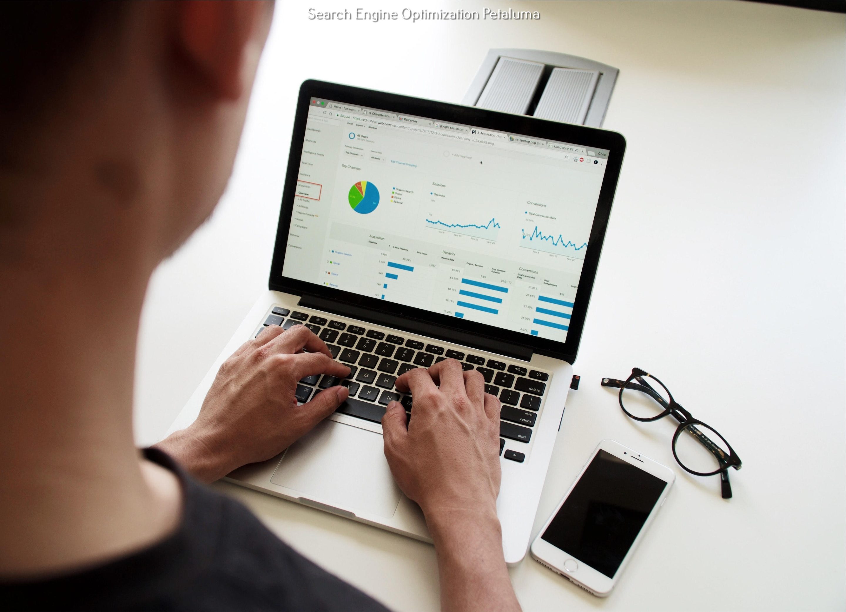
- Analyzing Performance: Tools like Google Analytics or Hotjar can show where users click, scroll, or drop off. These insights drive smarter design decisions.
- Balancing Form and Function: A great website needs to work well and look great. We aim for both — a sleek design that’s supported by intuitive navigation and clear messaging.
The Future of Web Design
Web design is evolving rapidly, with AI-driven tools increasingly playing a role in how websites are created and adapted on the fly. Personalization will move to the forefront, enabling websites to present tailored layouts, colors, and content that respond dynamically to user behavior, preferences, and location.
Despite these technological advances, the human element remains non-negotiable. Comprehending how people think and feel when interacting with a site will continue to guide design decisions, ensuring that technology serves real user needs rather than just aesthetics or automation.
Connect with RAD Web Marketing
The design has the power to turn a casual visitor into a loyal customer. At RAD Web Marketing, we bring strategy, psychology, and aesthetics together to craft digital experiences that feel right from the first click.
Get in touch with us at (707) 205-3600 or ashley@radwebmarketing.com for a free consultation. Let’s build a site that works for your users — and for you.


0 Comments